
The recommended YouTube thumbnail size is 3840 × 2160 pixels at 16:9 for standard videos. That's the current recommendation in YouTube's thumbnail Help, checked September 11, 2026.
File size needs a second question: how will you upload it? Desktop Studio and an API-connected publishing tool are not the same route. A file can fit the design canvas and still exceed the limit of the system sending it.
A real layout makes the size decision visible
This 1280 × 720 editorial thumbnail was assembled from two existing Advibly-generated peach-can scenes. It is a genuine 16:9 layout example, not a newly generated thumbnail, an uploaded YouTube result or a measured click-through winner. Its job is to show one product in two different creative settings.
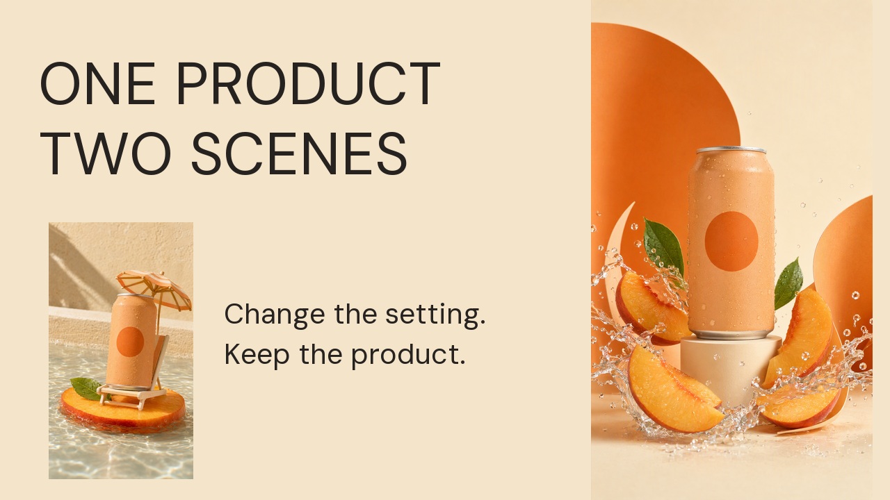
The layout preserves both source scenes rather than stretching a portrait image across the landscape canvas. ‘One product, two scenes’ names the visible comparison. The smaller line adds a production lesson: change the setting while retaining the product. This is suitable as a design exercise for a video that actually demonstrates those two scenes—not for an unrelated video.
The example uses a smaller existing-size canvas to demonstrate composition. For a new master, follow YouTube's current 3840 × 2160 recommendation below and use high-quality originals plus editable type. Upscaling this flattened JPEG does not create extra product detail.
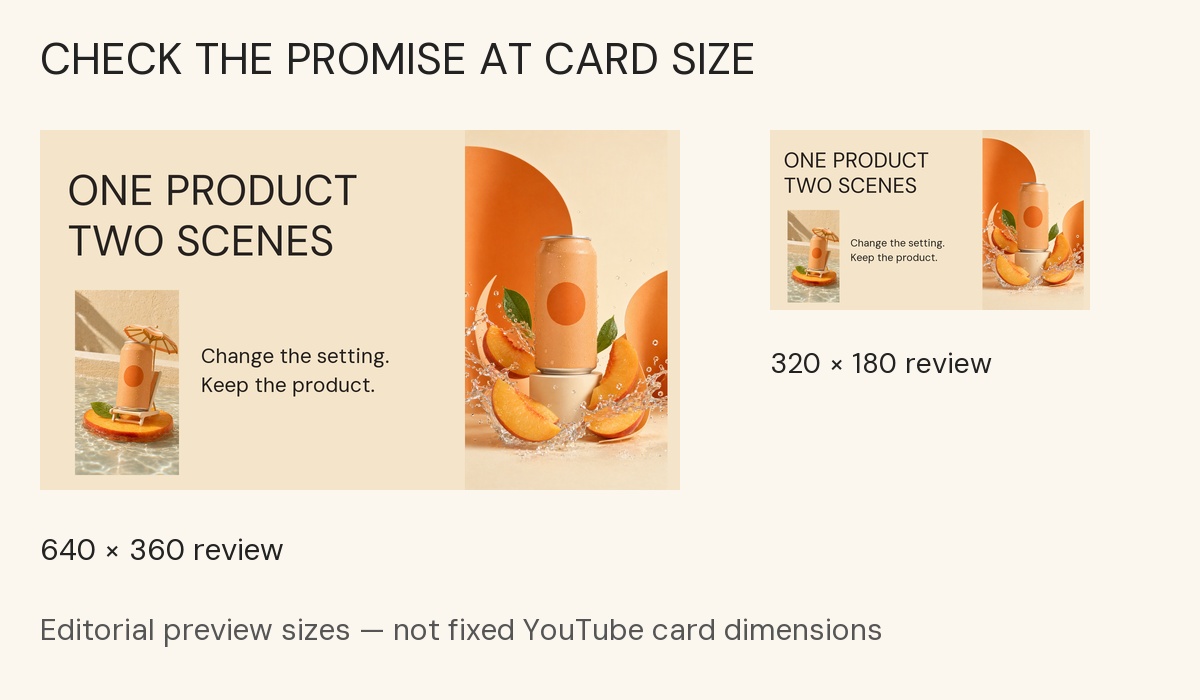
Editorial previews at 640 × 360 and 320 × 180, not fixed YouTube card dimensions. At the smaller size the main promise and peach can remain clear, while the supporting sentence becomes less prominent. If that sentence carried a critical qualification, move the qualification into the title or simplify the design; do not rely on tiny thumbnail copy.
Make your own version without regenerating the whole image
- Choose actual frames or approved product assets that match the video. In Advibly, reuse the saved brand and relevant generated results, or create only the missing scene from your product reference.
- Compose a 16:9 layout with the main subject and a short, accurate promise. Use an editor for exact positioning and editable type. The layout and review board shown here were local editorial derivatives, not a claim about a native Advibly layout-control screen.
- Inspect a small version before exporting the upload file. If the secondary image or copy vanishes, remove it or give it more room rather than just sharpening the file.
- Choose the upload route and compress accordingly. After upload, verify the actual thumbnail separately from the video's published status. A connected publishing operation may not apply the same thumbnail controls as Studio.
Create the missing thumbnail artwork in Advibly.
Generate your first creatives for free. Starter credits are for eligible generation, not a guaranteed free video or publishing plan. The export limits below determine which reviewed file to hand to the publisher.
Three complete cover masters
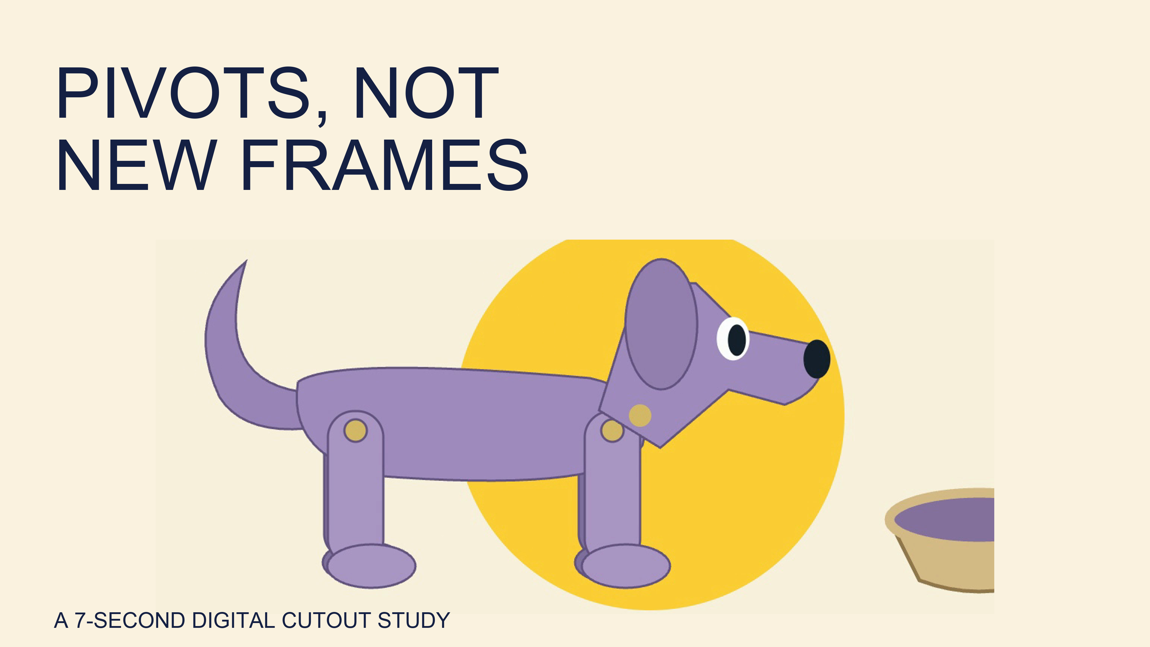
Open the exact standard cover 4k image.
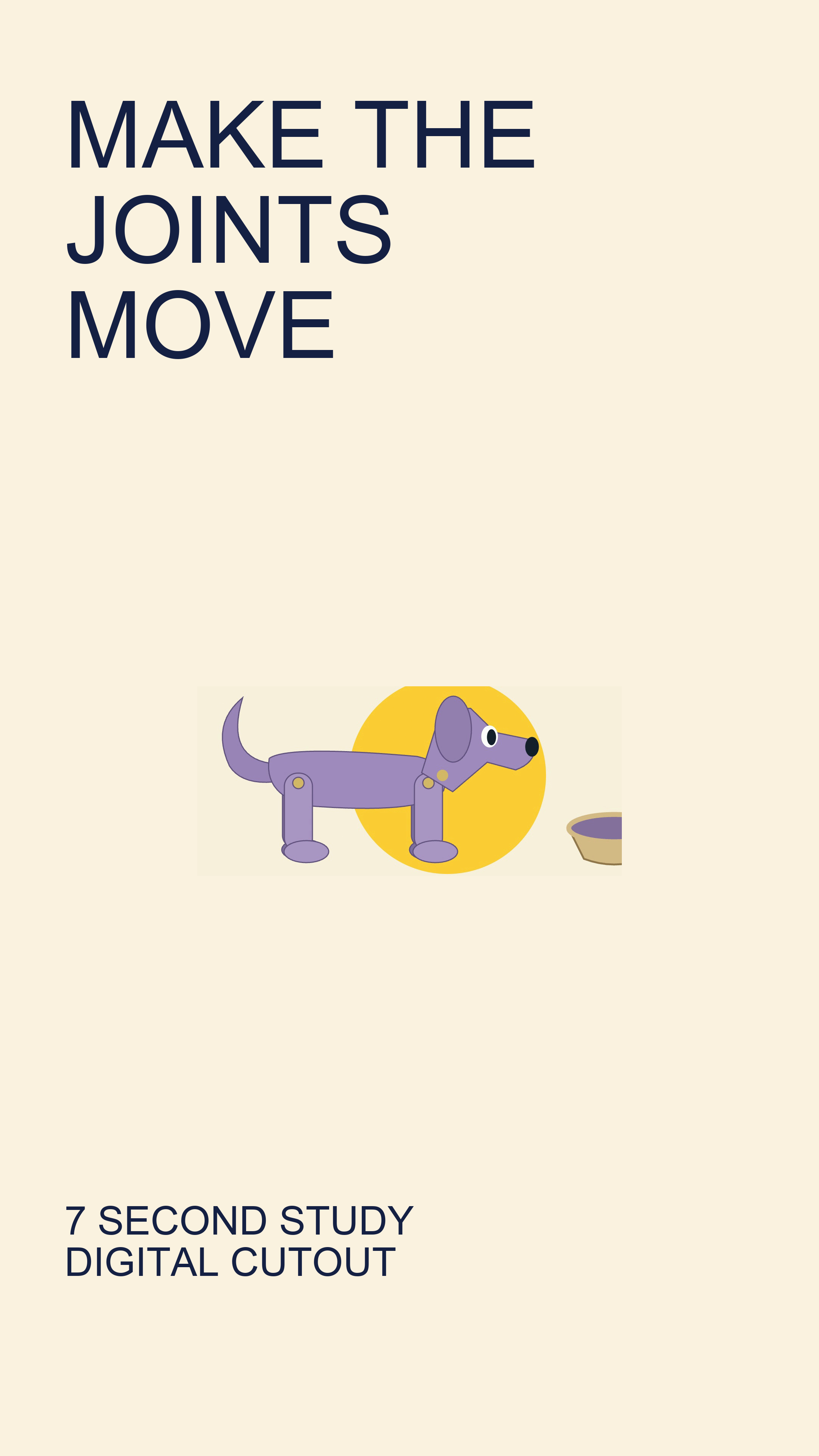
This 3840 × 2160 cover uses an actual frame from our seven-second digital-puppet film. The headline names the mechanism shown: joint pivots. Type was composed at master size; enlarging the raster character does not add character detail. Reduce the master to a small card to check the promise before upload.
Open the exact shorts cover 4k image.
This separately composed 2160 × 3840 cover points to the same short study, rather than inventing a video behind the thumbnail. It is a standalone vertical cover, not a Shorts upload preview or a vertical version of the landscape film.
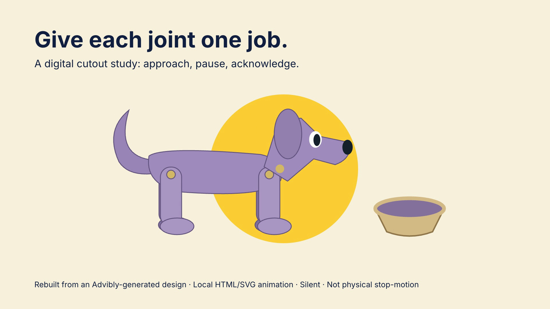
Open the exact articulated puppet poster image.
Watch the matching seven-second digital-puppet study (silent MP4)
Open the exact podcast programme image.
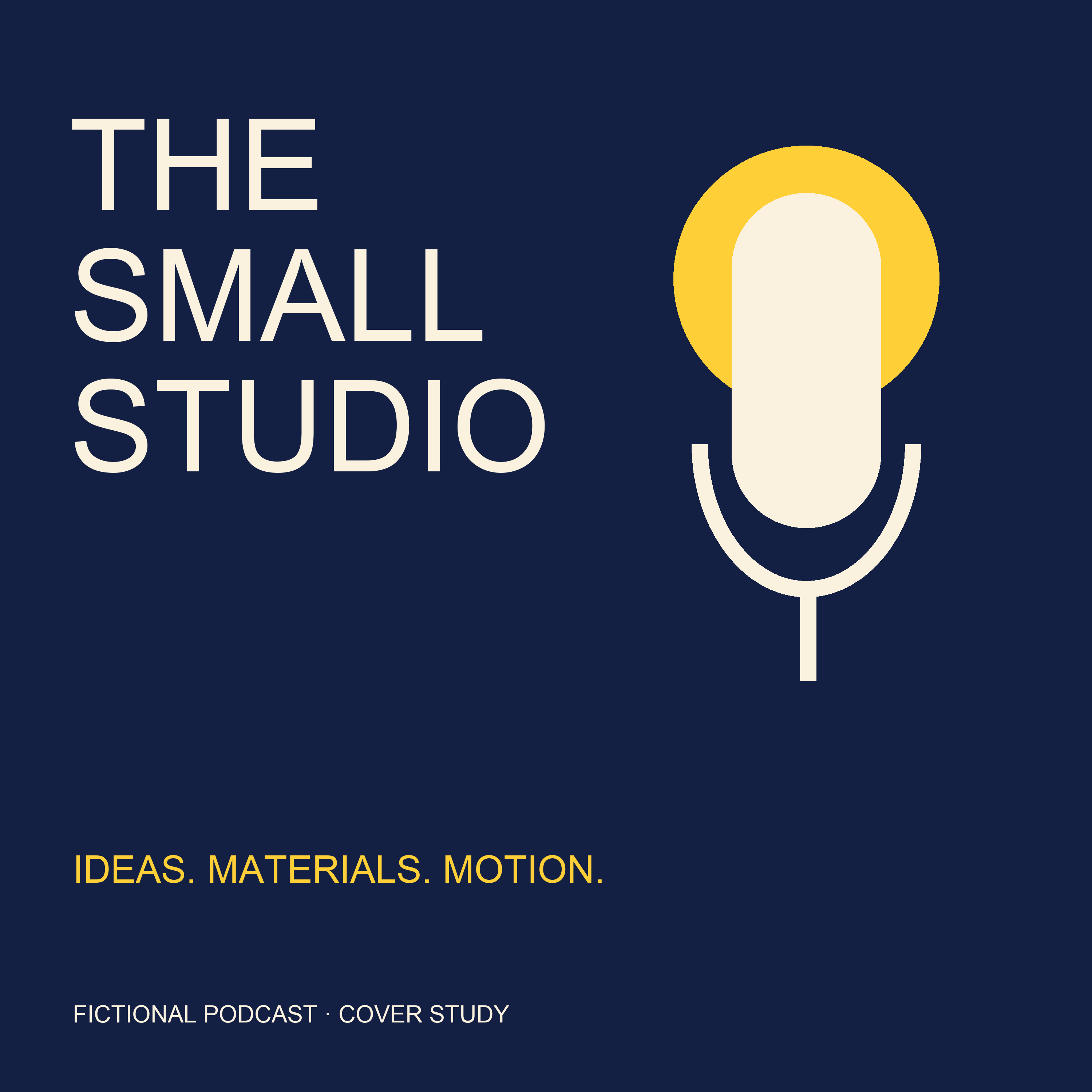
The Small Studio is a fictional programme identity, not a claim that a podcast has launched. The 3000 × 3000 square cover names the show and gives it a coherent microphone motif. Make an actual show title the largest element; use a small preview to test whether the identity survives.
Current YouTube thumbnail specifications
|
Item |
Official guidance |
|---|---|
|
Standard video |
3840 × 2160; 16:9; minimum width 640 pixels. |
|
Shorts |
2160 × 3840; 9:16; minimum height 640 pixels. |
|
Podcast playlist |
Square, 1:1 artwork. |
|
Image format |
JPG or PNG. |
|
Mobile interface |
2 MB video thumbnails; 10 MB podcast thumbnails. |
|
Desktop Studio |
50 MB video, Shorts and podcast thumbnails. |
A vertical thumbnail-shaped specimen
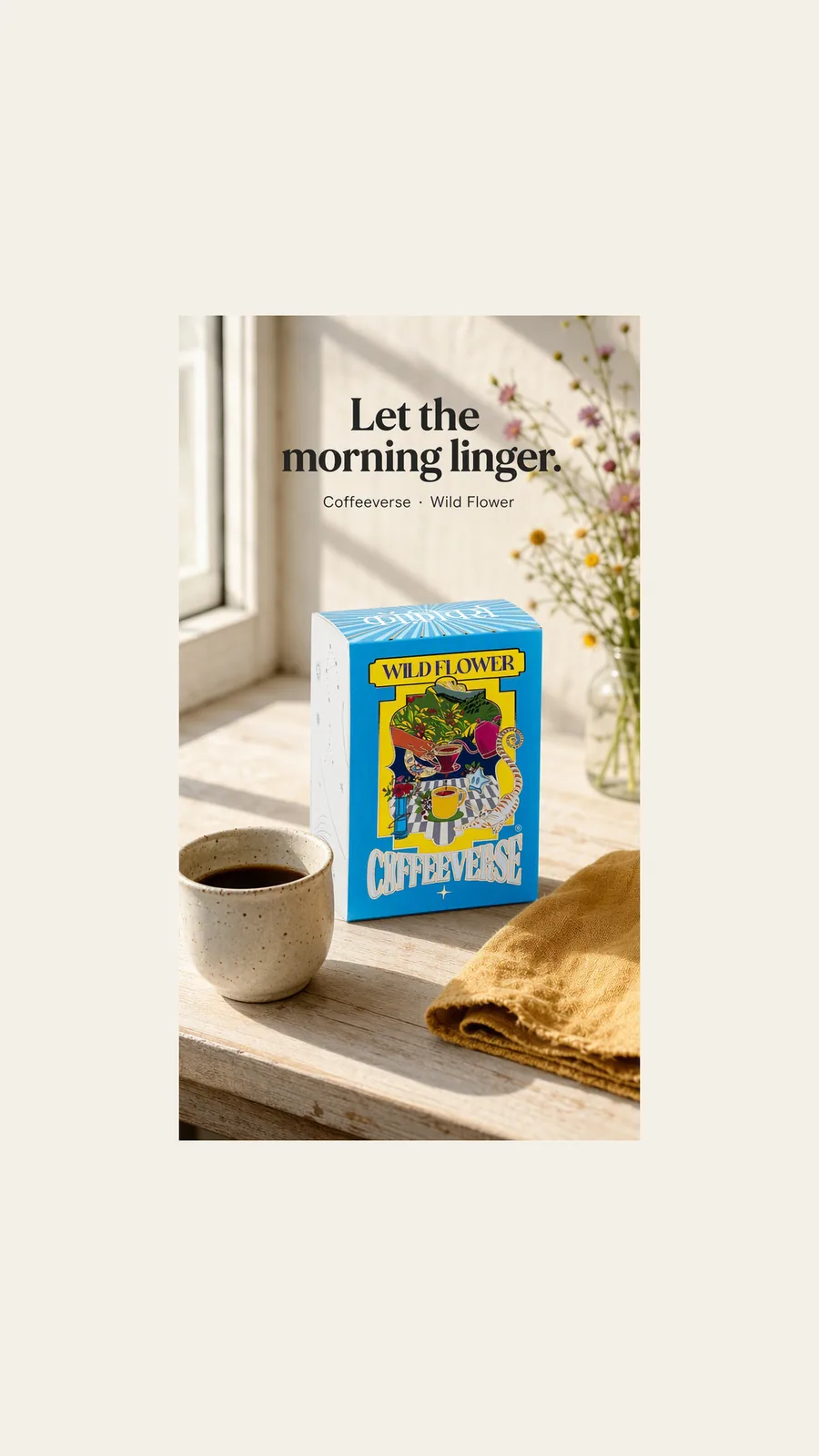
This exact 1080 × 1920 image shows a vertical composition. It is not a YouTube upload or a claim that this lower-resolution source meets the table’s recommended new master.
A square artwork specimen
The square poster shows what a separate square composition looks like. It is artwork, not evidence that a podcast exists; a real podcast cover must identify the actual programme.
Custom thumbnails require account verification. Shorts image uploads are currently available in computer Studio. Daily limits vary; changes can take time to appear. These are YouTube's interface rules, not universal limits for every integration.
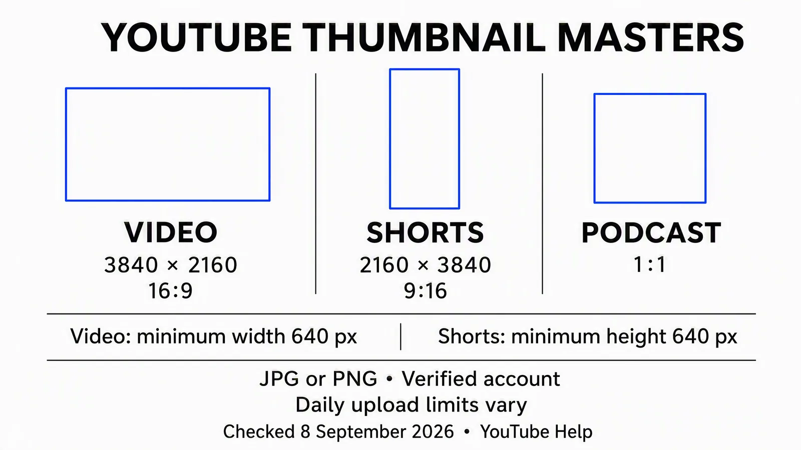
Reference card dated September 8; the specifications were rechecked for this article. Outlines are schematic, not exact-ratio templates. Set numeric dimensions in your editor rather than tracing the shapes.
The table gives you the canvas. It doesn't tell you how to compose the image or whether the viewer will understand it. Those decisions come next.
The API still has a different file limit
The YouTube Data API's thumbnails.set reference, updated September 4, 2026, specifies a 2 MB maximum upload. It accepts JPEG, PNG or an octet-stream upload. It also requires authorization to set the thumbnail for the target video.
This matters when a scheduler or automation sends the image through that endpoint. Opening the scheduler on a desktop computer doesn't make its upload a desktop Studio upload. Confirm the connected tool's actual requirements; it can impose its own restrictions too.
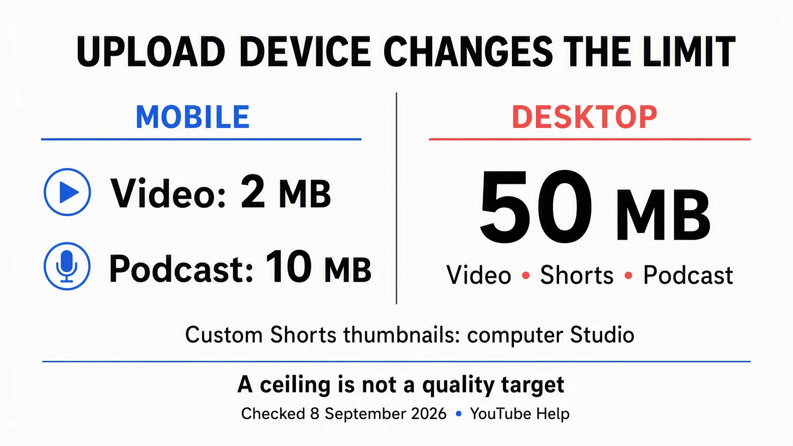
This September 8 card summarizes YouTube's mobile and desktop Studio interfaces only. It does not describe API or scheduler limits; use the endpoint or connected tool's requirements for those routes.
Worked example: suppose your approved image exports at 6 MB. Before repeatedly trying the same file, identify the upload route. For an API job, create a separate compressed export within the endpoint's cap, inspect it, and keep the original master. Don't reduce the video resolution to solve an image-upload problem.
The API also distinguishes an invalid image, insufficient permission, a missing video and a rate limit. A smaller file won't fix the wrong video ID or missing authorization. Read the error before changing the artwork.
Why an old 1280 × 720 file isn't automatically a redesign emergency
The old and new landscape sizes have the same ratio. Moving from 1280 × 720 to 3840 × 2160 triples each side and produces nine times as many pixels: 921,600 becomes 8,294,400. That's geometry, not nine times the detail or nine times the performance.
If your existing file is sharp enough for its use, keep it while you assess whether the design needs changing. For new work, start from high-quality source material and an editable layout. Merely stretching a small raster image doesn't recover detail that wasn't recorded.
Keep text, logos and other precise elements editable until export. If the source is a small screenshot, capture a better one where possible. If you need a new scene around an existing product, preserve the approved product reference instead of letting the generator redraw important details unchecked.
The practical question is not “Did the file become larger?” It's “Can someone recognize the subject and understand the promise in a small preview?”
Make a card-size check you can repeat
YouTube's thumbnail and title guidance recommends readable type, an uncomplicated design and an accurate relationship between the title and the video. It also notes that thumbnails appear differently across devices. Turn that advice into a short review routine.
Choose a few preview widths relevant to your own review. For example, 320 × 180 and 160 × 90 are useful landscape stress tests. These are chosen test sizes, not a claim that YouTube always renders cards at those dimensions.
At a 320-pixel preview width, a 3840-pixel master is reduced to one twelfth of its width. A 120-pixel-tall element in the flattened master becomes roughly 10 pixels tall. At 160 pixels wide it becomes roughly 5 pixels. Those calculations don't define an ideal font size; they explain why a paragraph of thumbnail text disappears.
Worked example, fictional desk-lamp tutorial: the first design contains a lamp, a desk, a person, a logo, three arrows and the full video title. At the smaller test size, the lamp is barely recognizable. Instead of sharpening everything, crop closer to the lamp and the area it illuminates, remove the redundant arrows, and use a short label only if it adds meaning the image lacks.
Review the image without reading the title first, then review the pair together. The thumbnail can show the visual question; the title can explain the task. They don't need to repeat one another word for word.
Map an overlay to the thumbnail, not the whole screenshot
A screenshot of a YouTube page includes navigation, whitespace, titles and other cards. Stretching that entire screenshot over your design will put the interface obstructions in the wrong places.
Use this editorial calibration method instead:
- Capture the specific surface you need to inspect and note its device, browser or app, date and display conditions.
- Identify the exact image rectangle inside the screenshot. Separate it from the surrounding page.
- Identify the image actually being displayed. Is it your custom file, a crop of it, or a different automatically selected frame?
- For an uncropped image with the same aspect ratio as your master, map positions relative to that image rectangle using a uniform scale.
- Mark observed controls or obstructions on a separate review layer. Test whether they cover essential meaning.
- Keep the observation tied to that surface. Recheck after a meaningful interface change; don't turn one screenshot into a permanent safe-zone promise.
Hypothetical coordinate example: a thumbnail rectangle in your screenshot measures 320 × 180. Its top-left corner is the local origin. If an observed obstruction occupies x=280 to 320 and y=160 to 180, multiplying each coordinate by 12 maps it to x=3360 to 3840 and y=1920 to 2160 on the landscape master.
Those are invented measurements used to explain the calculation, not YouTube badge dimensions. For a real screenshot, substitute the measured values. If the image was cropped, first establish the crop and offset; a simple scale alone is no longer enough. If it is a different source frame, review that frame separately rather than pretending it shares the custom image's coordinates.
The vertical-video exception: the image itself can change
YouTube says a vertical video's landscape custom thumbnail is replaced by an automatic 4:5 image on mobile Home, Explore and Subscriptions. The custom image remains on Watch feed, Watch History and non-mobile platforms. See the official exception.
Treat these as different artifacts in your review. Improving the custom artwork can't repair an unrelated automatically selected frame. Check whether the video itself offers clear, representative frames and inspect the actual result on the surfaces that matter to your release.
Don't build a fake universal “safe area” by intersecting the custom design with a frame from the video. They aren't necessarily the same picture. The general method above is useful precisely because it starts by identifying which image you're looking at.
A practical thumbnail handoff
One brief should tell the designer what to make and the publisher which file to use. Here's a filled example you can adapt; it describes a proposed asset, not a completed upload.
|
Handoff field |
Fictional desk-lamp tutorial |
|---|---|
|
Video promise |
Show how to position the lamp for a small writing desk. No measured eye-strain or productivity claim. |
|
Source material |
Approved lamp photograph and a real still from the tutorial. |
|
Main subject |
Lamp head and illuminated writing area; enough desk context to explain the setup. |
|
Text |
Optional short label “Desk light setup”; omit if it makes the small preview worse. |
|
Master |
Editable landscape layout with separate type and product layers. |
|
Upload route |
API-connected publisher; final image must meet the endpoint and tool's limits. |
|
Review |
Product identity, title-image match, card-size recognition and measured surface obstructions. |
|
Delivery |
Approved export, exact filename, video ID and destination channel. |
|
Verification |
Confirm the uploaded thumbnail matches the approved file; inspect the relevant viewer surface. |
Use distinct filenames for the master, upload export and any test variants. “Final-final-new” doesn't tell the next person which channel, video or concept the file belongs to. Include a short concept label and revision number, then record the selected version alongside the target video.
Create and reuse thumbnail assets in Advibly
Advibly can create video thumbnails and related campaign imagery from product and brand context. Start with assets you already trust: the real product photograph, app screenshot, logo, video still or previous approved visual. Save the brand context so a new thumbnail stays connected to the video and the surrounding campaign.
For the desk-lamp example, you could reuse the approved product image, explore a simpler background and create a second composition focused more closely on the illuminated desk. For an app tutorial, use a real screen from the demonstrated feature. Don't invent controls or a result the video doesn't show.
If the creative angle is unclear, Brand Intelligence can help turn product information and sourced market context into a brief. Generate or revise only the missing material, then inspect the actual image. Use a precise design editor when exact typography, manual compositing or numeric export control is the remaining job; you don't need to regenerate a good product image to move a label.
The same approved idea can support a thumbnail, a short video cut, a carousel and platform-specific launch copy. Advibly supports creation and scheduling to connected YouTube and other supported social accounts through its portal or compatible MCP workflows, followed by status checks and available analytics. Exact media formats, account permissions and plan entitlements apply.
For a custom-thumbnail job, confirm that the selected publishing operation accepts and applies that image. Video publication and custom-thumbnail application are separate outcomes. If that operation doesn't expose the setting, finish the thumbnail step in Studio rather than assuming it happened.
Create your thumbnail assets in Advibly, reuse the strongest existing source, and carry the approved export into the correct upload route. Generation creates options; the final selection still needs to represent the video accurately.
After upload, distinguish a design opinion from a test result
For eligible content, YouTube's native A/B testing can compare up to three title or thumbnail options in desktop Studio with advanced features enabled. Restrictions include Shorts, scheduled live streams, ongoing premieres, private videos, made-for-kids content and mature-audience content. Consult the current eligibility details before planning a test.
The native comparison uses watch time, not click-through rate alone, and can finish without a clear winner. Changing the title or thumbnail during the test stops it. Use the reported result rather than calling your favorite design the winner.
For a thumbnail-only question, keep the title fixed and give each visual a distinct idea. In the lamp example, one version could emphasize the object and another the lighting arrangement. A new color on an otherwise identical design tests a much narrower change.
Record what you changed, where the test ran and what it concluded. Available post-publication analytics can guide your next creative decision, but a metric moving after a manual change doesn't by itself prove that the thumbnail caused it.