A useful product advertisement example shows what belongs on screen and why. Compare the source-to-ad stories below, then choose between a product hero, a carousel, a creator explanation, a comparison and an offer-led image.
The product references below come from the linked public product pages. The advertisements are newly generated Advibly editorial concepts, not the brands’ campaigns, endorsements or customer results. Props, settings and illustrative offers do not establish product performance or what is included in an order.
Accessories: give the product a visual job
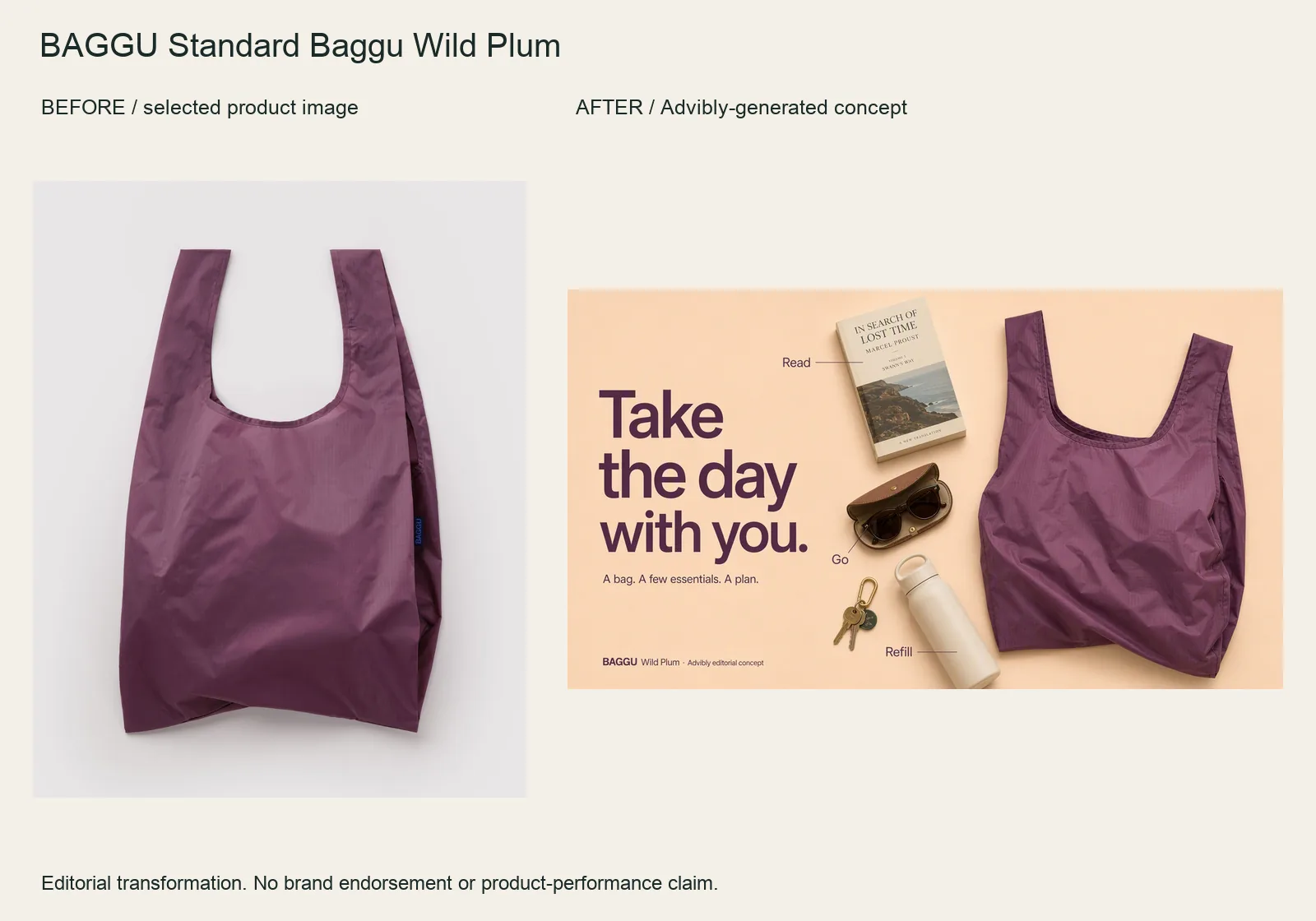
The Wild Plum bag becomes a wide flatlay with a book, bottle, sunglasses and keys. The “Read / Refill / Go” labels organize the idea rather than filling the frame with generic benefits.
Bring the bag image into Advibly and specify the objects, hierarchy and wide layout. Keep the handles, silhouette and fabric color stable. Items are arranged around the bag; this does not prove they fit inside or establish carrying capacity.
BAGGU Standard Baggu Wild Plum product source · Open the finished editorial image
Apparel: one tee, three styling directions
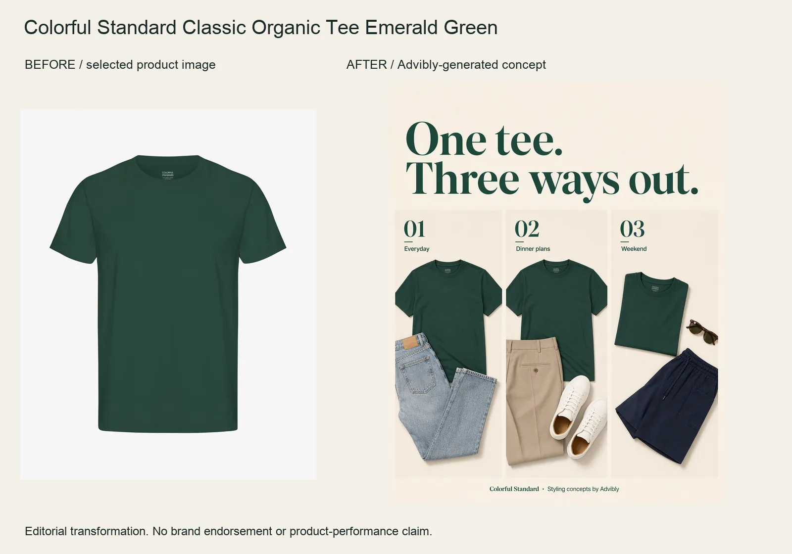
The Emerald Green tee becomes a three-panel styling collage. Jeans, tailored trousers and shorts create three different outfit ideas around the same plain crewneck.
Keep the reference tee’s color, cut and lack of print fixed. Request distinct styling panels rather than inventing three new SKUs. Other clothes are styling props, not an offered bundle; the generated arrangements do not prove physical fit.
Colorful Standard Classic Organic Tee Emerald Green product source · Open the finished editorial image
Home fragrance: turn a product into a gifting idea
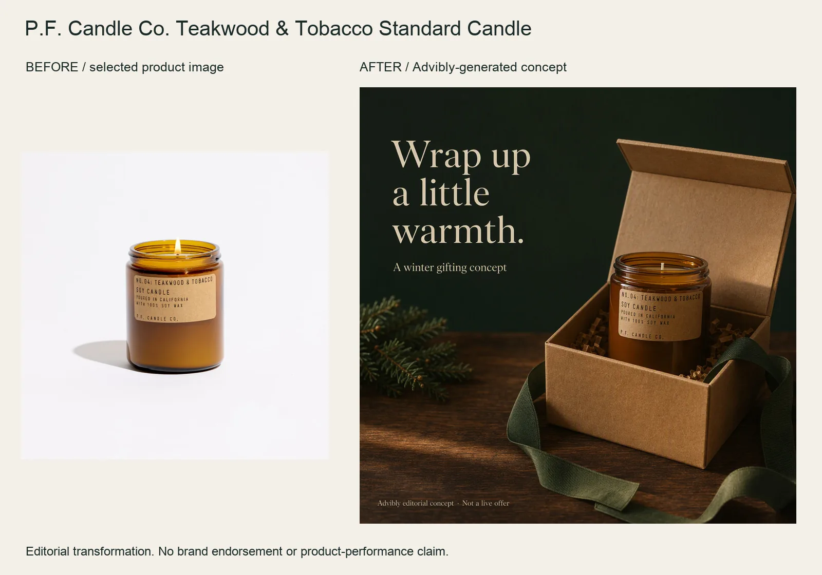
The selected amber candle jar becomes a winter-gifting composition with an open kraft box, green ribbon and an unlit wick. The change is the campaign occasion rather than a new candle.
Protect the jar and label in the reference-led brief. Ask for gifting props without presenting them as supplied packaging. This is a styling concept, not a current gift bundle, discount, burn-time claim or sleep benefit.
P.F. Candle Co. Teakwood & Tobacco Standard Candle product source · Open the finished editorial image
Creator-style: show the product through a person's presentation
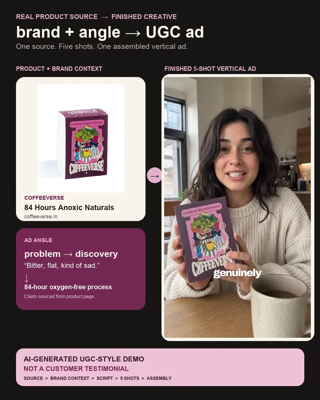
Watch the complete source-to-output Coffeeverse example (MP4). The wrapper keeps the product source beside five assembled creator-style segments and carries a permanent AI-generated, non-testimonial disclosure.
The presenter, product holding and camera changes demonstrate a creator-style format rather than a static composition. The creator’s taste language is scripted, not verified customer experience; it does not establish Coffeeverse endorsement, sensory truth or campaign results.
Bring a cleared product image and one supported message to the UGC Ads workflow. Plan the product-bearing shot before generating the presenter. Generate your first creatives for free. If your buyer needs to inspect an exact mechanism, use real footage for that part instead.
Key takeaways
- Pick the evidence first. A moving image isn't automatically more convincing than a still.
- Borrow a campaign's reasoning, not its artwork, customer claims, or reported results.
- Use real product sources for factual demonstrations; label generated concepts as illustrations.
- Keep one brief across your image, video, carousel, and social variations. Change the execution for each destination.
Six product advertisement examples and what to learn from them
These are campaign observations, not a ranking of winners. The application ideas are our editorial recommendations. None establishes how the same approach would perform for your product.
1. Apple: let the output demonstrate the product
Apple's “One Night on iPhone 7” campaign used photographs taken from dusk to dawn to showcase the phone's low-light camera. Its January 2017 announcement identifies photographers and locations, making the work more specific than an anonymous gallery of beautiful pictures.
The useful choice is output before specification. If you sell something whose result can be inspected, show that result large enough to judge. A print shop might show a real print beside its source file; an app might show an actual export beside the screen that produced it.
Don't replace the output with an AI-generated approximation and call it product proof. You can use generated scenes around an authentic product image, but the part carrying the factual claim must remain accurate. This historical campaign isn't evidence about today's iPhone models, and its photographs aren't a free asset library.
2. Purple: turn an abstract property into an observable event
Purple describes its Raw Egg Test as a demonstration of softness and support. The unusual test gives viewers something concrete to watch instead of asking them to interpret mattress terminology.
Ask what single action makes your product's mechanism understandable. A bag's opening can reveal how the compartments are arranged. A real screen recording can show what happens when a user changes one setting. The action should answer a buying question, not merely create movement.
The distinction matters: an engaging brand demonstration is not a controlled scientific study. Don't borrow the theatrical test and attach a broader durability, health, or performance claim that your evidence doesn't support.
3. Slack: explain the changed work, not every control
James Sherrett's retrospective on “So Yeah, We Tried Slack” includes the historical film's script. A team starts with communication scattered across different tools. The story then introduces Slack through the work the team does together.
For a SaaS or app explainer, that suggests a useful sequence: recognizable problem → one product behavior → a changed workflow. “Find the latest approved file” is a clearer story than “Explore our powerful collaboration platform.” Show what someone can now do.
If you're creating this in Advibly, real app screenshots can anchor the explanation while a whiteboard-doodle or paper-collage treatment connects the steps. Animation supplies the explanation; it shouldn't invent a functioning interface. Use the historical Slack film for narrative structure, not current UI instructions.
4. e.l.f.: plan a family of creator interpretations
TikTok's e.l.f. case study describes creator-led content and community participation, with native assets amplified through placements including Spark Ads. The campaign lesson is about a connected set of assets, not a magic “UGC look.”
Give creators a common product fact and room to explain the situation in their own way. One could demonstrate use; another could address a specific objection. Keep the brief consistent without making every person recite the same script.
An AI presenter can explain or illustrate product use, but cannot supply an actual customer's experience. For U.S. endorsements, FTC guidance says material brand relationships should be disclosed clearly, with video disclosures in the video rather than only its description. TikTok's reported campaign results are not forecasts for your campaign.
5. Google: make a comparison into a situation
Google's account of its Best Phones Forever campaign describes Pixel and iPhone as friendly characters. Its 2024 AI Roadtrip extension used audience location suggestions to create new scenes, with the creative team selecting and reviewing the generated material.
The transferable idea is a comparison people can follow as a story. Rather than listing twelve features, dramatize the one difference that matters to a particular buyer. A hypothetical comparison between two bags might focus on accessing a laptop during travel, provided the scene accurately represents both products.
Choose the decision first, then verify the facts used to stage it. A historical phone episode is not a current specification sheet. Nor does Google's custom production system establish that another tool offers the same automation.
6. Canva: adapt the execution, keep the campaign recognizable
Canva's “What Will You Design Today?” showcase presents a campaign across television, social edits, TikTok, audio, and display. It explicitly describes social edits designed for sound-off viewing and a different voice for TikTok.
That is more useful than “resize the master.” Decide what each version has to explain without sound, what can be understood in one frame, and what needs a sequence.
For a product launch, your video could demonstrate the central action, a carousel could unpack the steps, and a static could show the finished result. All three can come from the same saved brand context in Advibly. They don't need identical copy or the same crop to feel like one campaign.
Choose a product-ad format by the proof it needs
Use the smallest format that answers the buyer's question clearly. “Smallest” means the least production needed to explain the claim, not a rule that short ads always perform better.
|
What the buyer needs to understand |
Start with this format |
|---|---|
|
What the product or its output looks like |
Static image or short reveal, with the relevant detail visible. |
|
What happens when the product is used |
Demonstration showing the starting state, action, and result. |
|
How it fits a person's situation |
Creator explanation or genuine use experience, with appropriate disclosure. |
|
How an unfamiliar workflow works |
Explainer or carousel organized around the changed task. |
|
Which verifiable difference affects the choice |
Comparison with the evidence and a meaningful tradeoff. |
|
What is included and what the buyer must do |
Offer-led creative with clear, current terms. |
Visible specimens for the format selector
Static product image
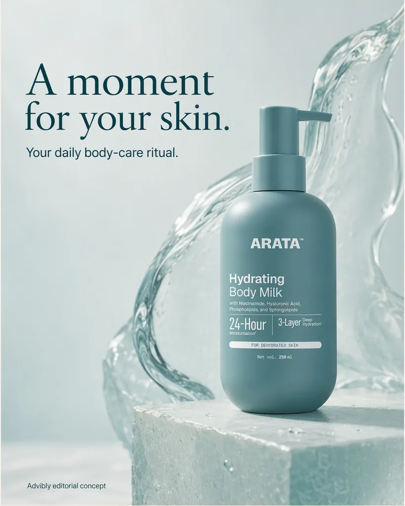
One product, one art-directed visual and one headline. The water sculpture is styling, not ingredient proof.
Explanatory carousel
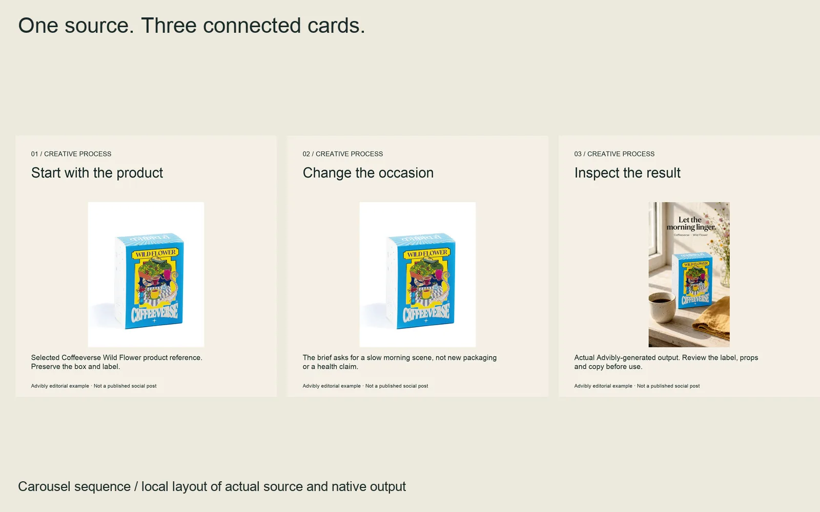
Three actual cards explain the creative-production relationship. This is a carousel specimen, not a fabricated app walkthrough.
Comparison of creative approaches
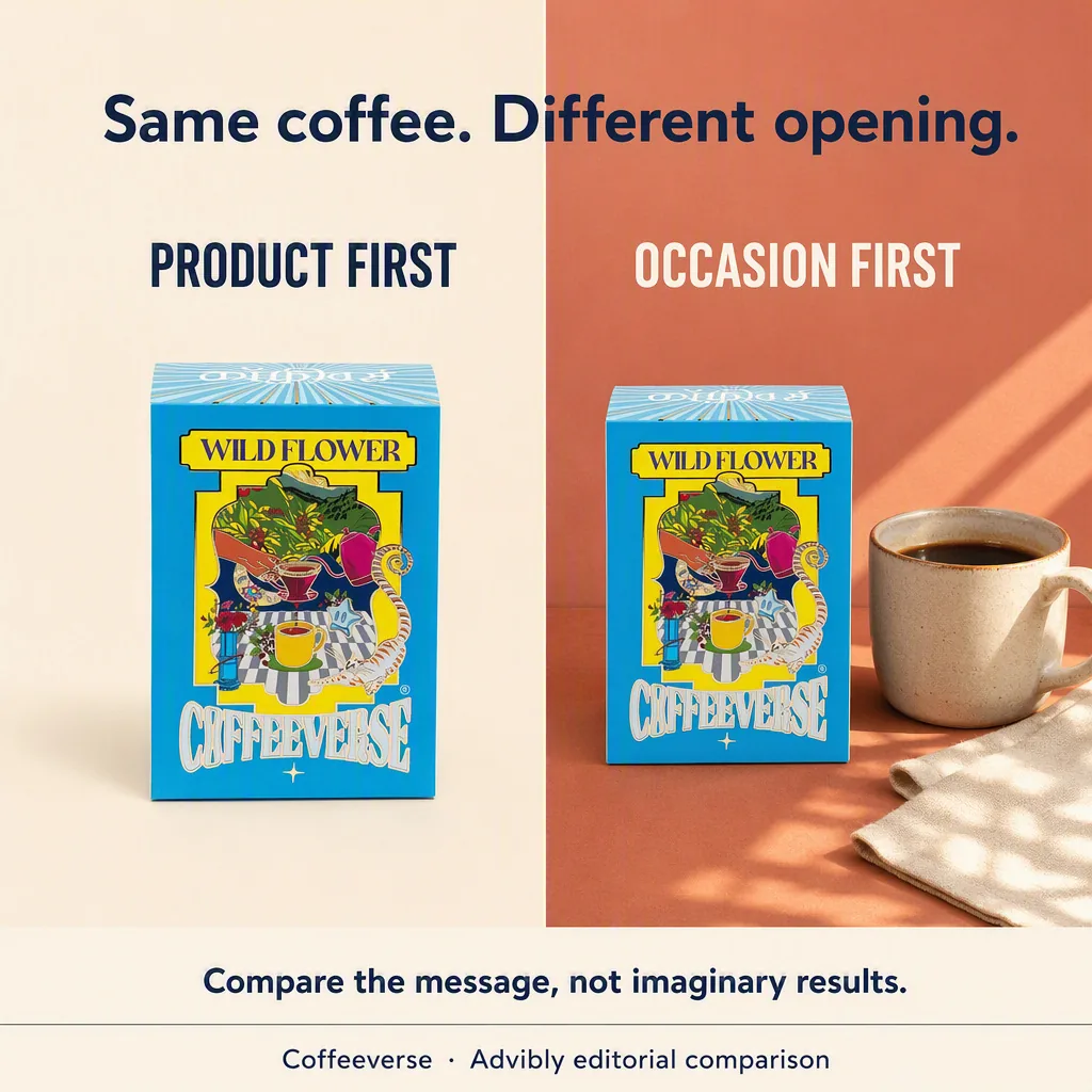
Same product, two message structures. This shows product-first versus occasion-first creative; it is not a factual competitor comparison, a controlled pixel-identical test or a performance result.
Offer-led layout
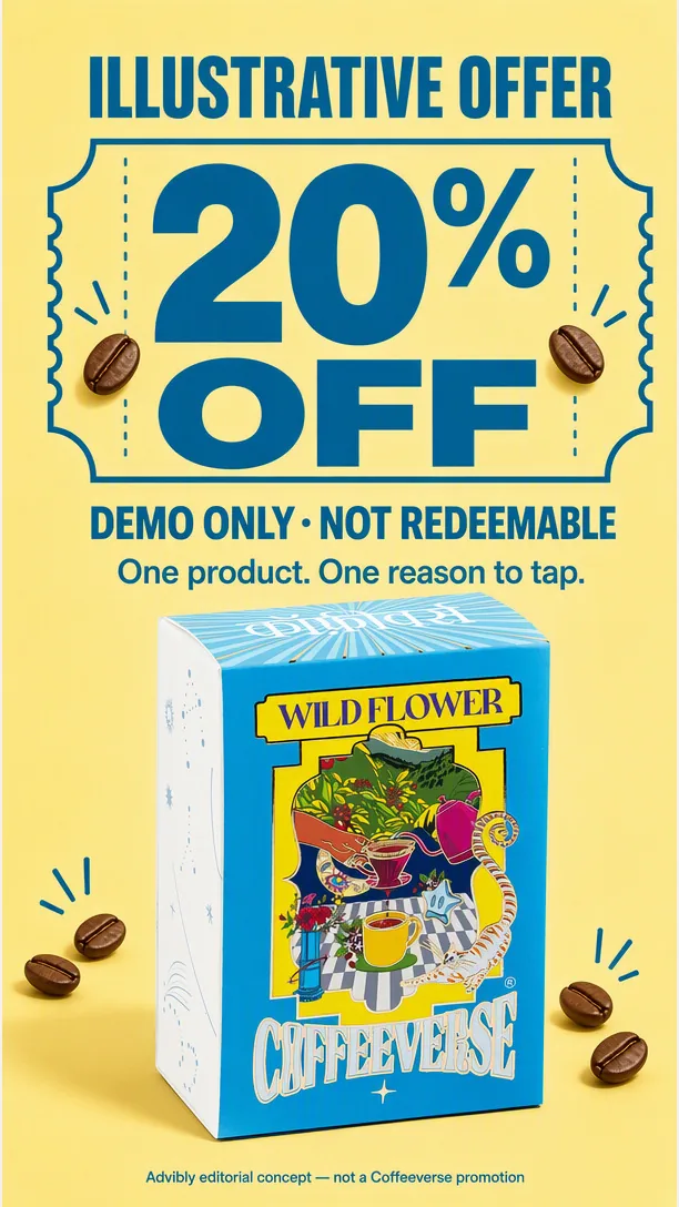
The displayed discount is prominently marked illustrative and not redeemable. It teaches offer hierarchy without claiming a real promotion.
The planning sequence is: campaign job → supported truth → proof → format → structure → first test. A campaign job might be to introduce a product, clarify how it works, address an objection, distinguish an alternative, or explain an offer. Choose one primary job for this creative.
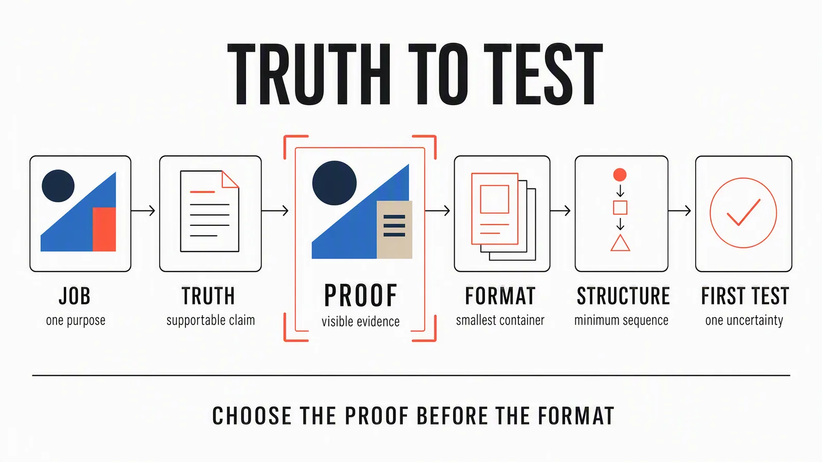
Editorial planning guide. Write the claim and identify its evidence before choosing the format. The sequence above provides the text equivalent.
For an offer, the commercial terms are part of the explanation. Show what is included, the price or trial conditions, relevant eligibility, renewal or expiry, and the next action. A prominent discount with unreadable conditions is not a complete offer.
A fully specified fictional offer layout
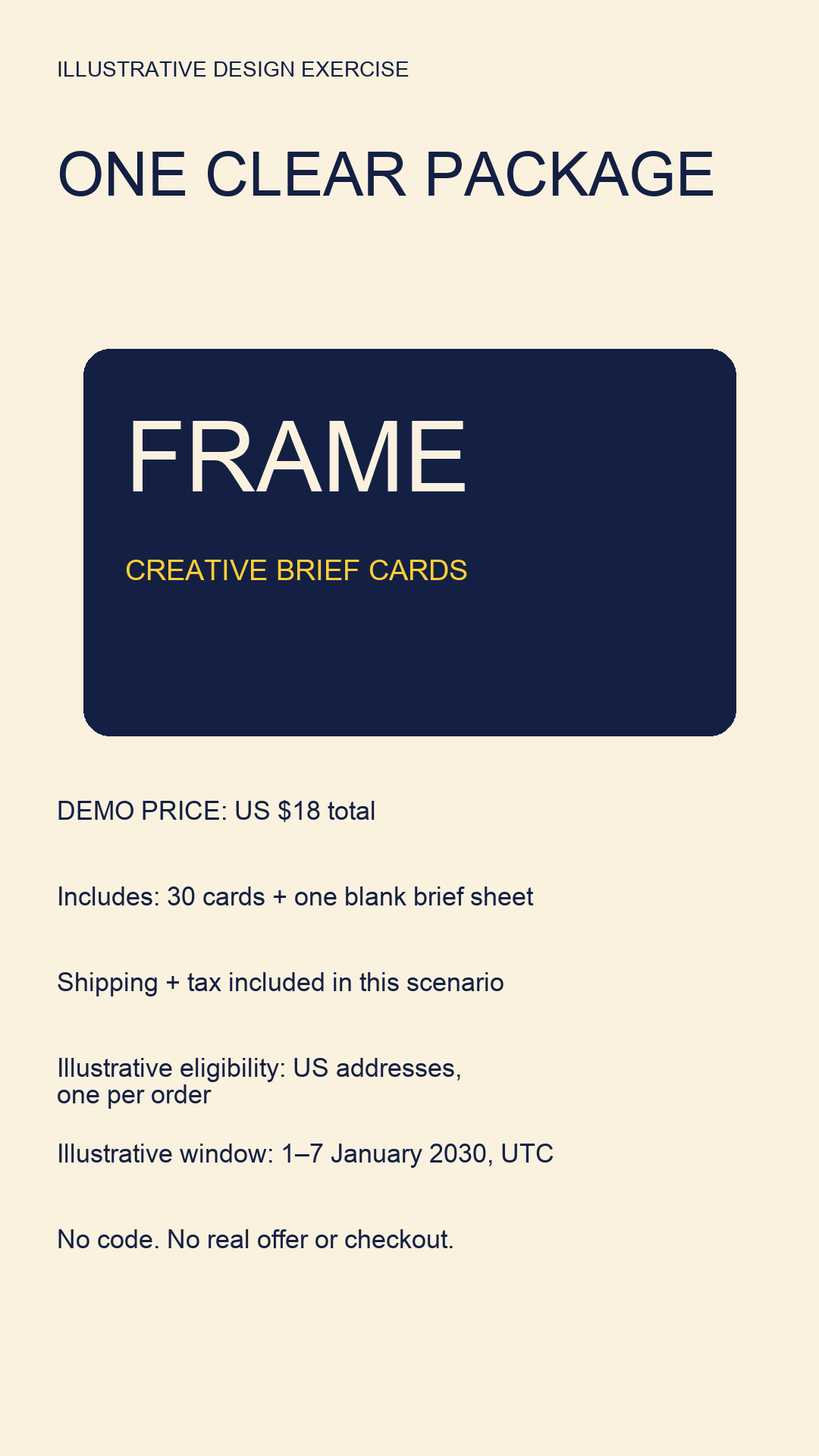
Open the exact fictional offer image.
FRAME is a fictional creative-brief-card product used solely to demonstrate layout. The card makes the total price, inclusions, shipping and tax, eligibility and dated UTC window visible. There is no real offer, checkout, discount or availability claim. For a live promotion, replace every scenario term with approved current terms and a verified destination; do not publish the scenario as an offer.
See the difference between a creative concept and product proof
The clip below illustrates a creator-style interaction: a fixed overhead view, one action, then time to inspect the open notebook. It gives the viewer a clear object and a visible sequence without a complicated story.
Open the silent notebook illustration
AI-generated illustration made with OmniFlash through Advibly. The hands and notebook are synthetic. Audio was removed; the picture is unchanged. This is a creative example, not a customer testimonial or evidence of a real notebook's performance.
A real notebook brand could use that structure to plan footage of its own product. To claim that the binding lies flat, show the actual notebook doing so. To explore a launch mood or visual treatment, generated footage can be useful without being presented as a product test.
That distinction also applies to software. A generated animation can explain the idea of receipt capture. A claim about what your receipt app extracts needs an accurate recording or output from the app. Use these before-and-after ad examples to plan a comparison that makes the starting and ending states clear.
A worked Product Ad Proof Brief
Suppose a fictional receipt app turns a photographed receipt into an editable expense entry. This is a teaching example, not an actual product test. Its useful promise is specific: capture produces something the user can inspect and correct, not a claim of perfect bookkeeping.
Use the following ten fields as a brief you can adapt:
- Product and audience moment: a small-business owner sorting paper receipts before bookkeeping.
- Campaign job: explain the capture-to-entry workflow.
- Supported truth: a receipt photo becomes an editable entry; the user reviews extracted fields.
- Proof: real capture footage and the resulting editable fields, using privacy-safe sample data.
- Format and placement: a short vertical demonstration for a supported social video destination.
- Opening: start on the completed entry beside the source receipt.
- Sequence: receipt, capture, extracted fields, correction, saved entry.
- Action: invite the viewer to try capturing one receipt.
- Checks: confirm the actual app behavior, readable fields, source-data privacy, usage rights, and destination preview.
- First comparison: result-first opening versus capture-first opening, keeping the remaining creative and offer consistent.
Before using this brief for a real app, replace the hypothetical behavior with verified product facts. If the app doesn't allow field correction, the brief is wrong; a better render won't fix it.
Turn that brief into a connected set of assets
The static can place the receipt beside a real editable entry. The video can show how it got there. A carousel can walk through capture, review, correction, and save without asking the reader to pause a clip. Each does a different explanatory job.
Write a first line for each version rather than reusing a slogan. For this fictional app: “From this receipt to an entry you can review” fits an output comparison. “Check the amount before you save” fits a correction-focused carousel. Neither invents a time saving or an accuracy rate.
If the entry is hard to read on a phone, enlarge the relevant fields or separate them into slides. Don't shrink an entire desktop screenshot into a decorative phone frame and call the workflow explained.
Build the campaign in Advibly without rebuilding the brief
Start with what you already have: the product page, app listing, screenshots, product photos, and approved brand assets. Save the brand context so subsequent images, videos, and carousels can use the same identity and product information.
When the angle is still vague, Brand Intelligence turns product information and research into a brief and sourced dossier, including market context, competitors, and customer language. Use it to sharpen the buyer's question. Then select the specific claim and source material for this ad.
For the receipt-app example, a practical production path is:
- Static direction: use image creation with real app screens and the approved visual identity. Explore composition and background while preserving the factual interface.
- Explanation: create a screen-led video, or use a whiteboard-doodle or isometric-flat-vector treatment to explain the workflow around those screens. A single generated clip and a finished narrated explainer are different deliverables; brief the scenes, voiceover, captions, and assembly you need.
- Supporting content: turn the same idea into an Instagram or LinkedIn carousel, a thumbnail, and destination-specific captions. Reuse the approved source assets instead of generating everything again.
You can work directly in the portal or coordinate the supported operations from an AI assistant through Advibly's MCP connection. One initiating brief can start the workflow; it doesn't remove the need to choose inputs and review the output.
For an ecommerce product, the same path can start from a Shopify page and product photos: create a campaign scene, animate a selected still, then make the matching caption and social post. The proof brief remains useful even when the source material changes.
Take the approved creative into social publishing
Use the content calendar and scheduler to organize approved posts and publish to connected accounts. Match the media and copy to the destination rather than assuming one file fits every network.
For an Instagram post offering a useful setup guide, you can add a keyword such as GUIDE and use comment-to-DM automation to deliver its link. Choose the keyword, destination, and link-button wording. That is a specific follow-up to the post, not a universal cross-platform DM bot.
After release, use publication status and analytics to review what went out and inform the next creative brief. Social scheduling and publishing are separate from launching a paid campaign in Meta Ads Manager or Google Ads; preparing the ad asset does not buy media.
Test a clear question, then improve the brief
Choose the uncertainty before making more variations. If people don't understand the product, compare an outcome-first opening with a mechanism-first opening. If the offer is hard to follow, compare bundle-first and price-first presentation while keeping the actual terms identical.
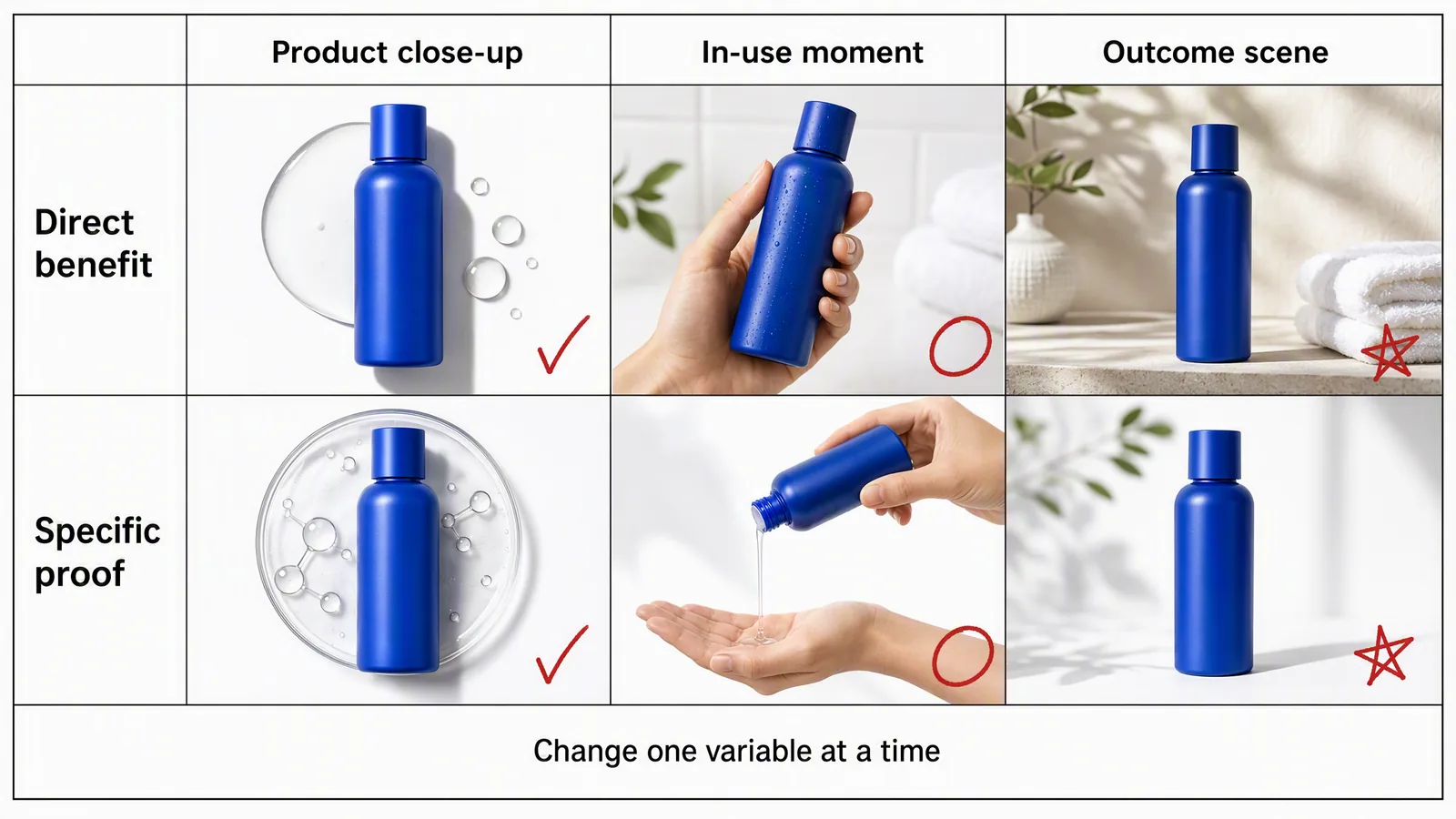
Concept directions, not test results. The marks do not identify winners, and a bottle scene is not evidence of a product benefit. The grid changes several visual details; build a matched pair before calling a comparison a one-variable test.
For a matched pair, hold the product, approved claim, offer, call to action, and remaining sequence constant. Change the opening you want to compare. If you also change the audience, distribution, or release conditions, note that when interpreting the result. Organic posts at different times are not automatically a controlled experiment.
Define the outcome you care about before reviewing the numbers. A format that attracts attention hasn't necessarily explained the product or produced qualified action. Use the results you can actually observe, with their limitations, rather than declaring a winner from a visually appealing mockup.
Your next brief should name the unresolved question more precisely. Start with one product, one buyer question, and one piece of evidence. Then create the image, video, or carousel that makes that evidence easiest to understand.