For an organic LinkedIn image post, 1200 × 1200 square or 1200 × 1500 portrait are useful starting canvases. Use 1200 × 628 for a landscape graphic, consistent 4:5 pages for a portrait document, and a video frame that keeps the subject readable. A fetched link preview is a separate job, with 1200 × 627 in LinkedIn's website-sharing guidance.
Those organic canvases are editorial production choices, not mandatory pixel dimensions for every post. The file's type, ratio, size and upload route must also fit. The official sources below were checked September 12, 2026.
What happens to a real creative when the shape changes?
This square file is an actual adaptation of an Advibly-generated peach-can image. The original is tall, with room above the can and a splash below it. The square keeps the can but sacrifices that breathing room. Choose the format by the message, not by whichever export button is easiest.
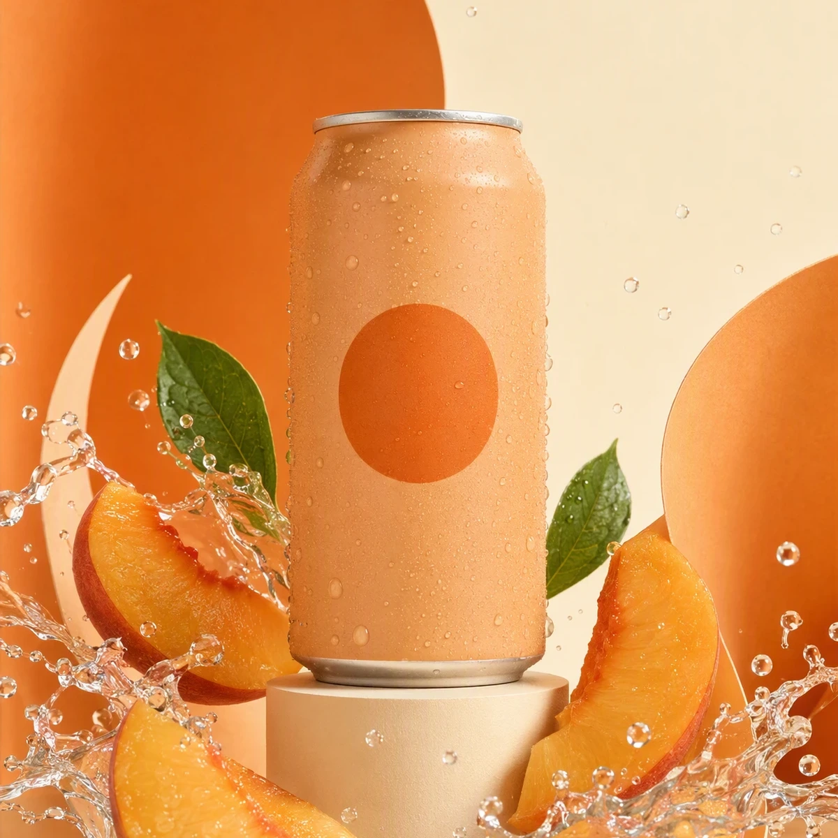
Actual 1200 × 1200 editorial center crop of the existing 1152 × 2048 concept image. The crop is real; it is not a screenshot of LinkedIn cropping a post.
For a product-led square post, this crop can work because the can and circle remain whole. If the missing upper area contained your headline, it would fail. Advibly can create the campaign image; an export still needs this placement-specific judgment.
Key takeaways
- Choose image, document, video or link preview before exporting.
- Keep practical design canvases separate from official upload limits.
- Don't use paid-ad specifications as universal organic-post rules.
- Preview the actual file and destination, then verify the published result.
LinkedIn post sizes: quick export guide
|
What you're making |
Starting file and why |
|---|---|
|
Square image |
1200 × 1200, 1:1. A practical master for a compact message or product graphic. |
|
Portrait image |
1200 × 1500, 4:5. A practical master when the layout needs more vertical space. |
|
Landscape image |
1200 × 628, about 1.91:1. A practical master for a wide composition. |
|
Multi-image post |
Start with a consistent ratio, such as 1:1. Review the assembled layout, not just each file. |
|
Document post |
PDF with equal-sized pages. A 1080 × 1350 design canvas gives a practical 4:5 layout; PDF pages don't require that pixel count. |
|
Organic video |
Consider 1080 × 1350 for a portrait composition or 1920 × 1080 for a wide demo. These are chosen masters within a broader accepted range. |
|
Website link preview |
Prepare 1200 × 627 and check the destination's metadata. This follows LinkedIn's sharing-module guidance, not the rule for every uploaded photo. |
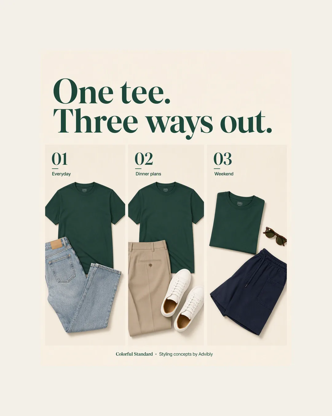
Actual 1080 × 1350 portrait export of the styling collage. Text and images were fitted proportionally, not stretched.
The distinction between 627 and 628 isn't a reason to rebuild your whole campaign. Use the dimension specified for the relevant output, and don't confuse a one-pixel export difference with a completely wrong composition or stale fetched image.
The named portrait master, exported
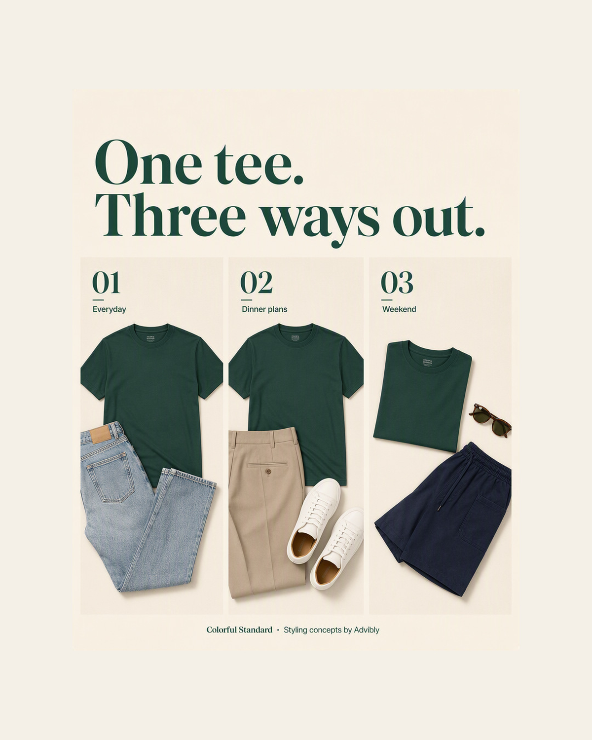
Open the exact portrait master 1200x1500 image.
This is the retained apparel styling composition exported at the stated 1200 × 1500 practical master. Both axes scale together, so the design remains 4:5. It does not add detail to the original generated artwork. Inspect this exact file, then review the actual post uploader separately.
First, identify the thing you're trying to fix
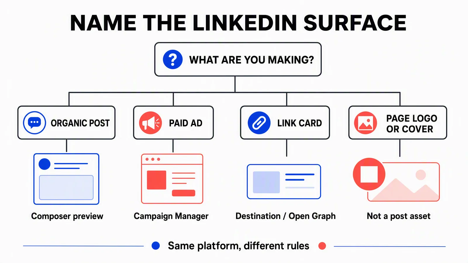
These are diagnostic paths, not mutually exclusive categories. A link card can appear in an organic or paid context. A Page logo or cover isn't a feed-post asset.
If an uploaded product graphic is cropped, inspect the graphic and post layout. If a website preview shows an old launch image, inspect the destination and LinkedIn's cached preview. If Campaign Manager rejects a file, use the ad format's requirements. Resizing the same image repeatedly won't fix all three problems.
Page branding is separate again. The current Page image specifications list 400 × 400 for the recommended logo and 1512 × 256 for the Page cover. Don't use either as a post template.
Organic image limits and practical layout choices
LinkedIn's photo-sharing guidance specifies a 5 MB upload limit, at least 552 × 276 pixels, and recommends a width of 1080 pixels. It gives a width-to-height ratio range from 3:1 to 4:5; images outside the range can be centered and cropped. It also says uploaded photos can't be edited or resized after posting.
For broadly compatible static exports, use JPEG or PNG. LinkedIn's media-type reference lists both across desktop, iOS and Android, and gives a 36-megapixel image ceiling. It lists some additional formats only for particular devices. Don't assume an Android-specific file format will work through a desktop composer or scheduling integration.
File weight and pixel count answer different questions. A 1200 × 1500 image has 1.8 million pixels. That doesn't tell you whether the compressed file is under 5 MB: photographic detail, noise, format and export settings affect the bytes. Check the exported file, not only the canvas settings.
For a product announcement, begin with a clear subject, one readable promise and enough room around important details. Use portrait space for a tall product or short stacked explanation. A wide software screen can need a landscape layout or a carefully selected detail view instead of a narrow crop that hides the relevant controls.
Multiple images need a sequence check
The photo-sharing guide allows up to 20 images and gives the first image particular layout importance. Its multi-photo display guidance describes a maximum 4:5 container and crops that depend on the image arrangement. LinkedIn's Page posts FAQ also says count and orientation determine layout.
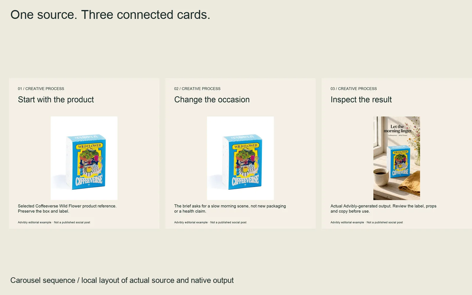
A real three-card sequence: source, constraint and returned output. Each square file is 1080 × 1080; order is part of the deliverable.
Open the cards: card 1, card 2, card 3.
Treat the first image as the introduction, not a random thumbnail. Upload in the intended order, inspect the combined post, then open each image. Avoid making a small text label on a later tile the only place the viewer can understand the offer. A multi-image post and a swipeable PDF document are different outputs, even when both contain a sequence of graphics.
Document post dimensions: design for pages, not screenshots
A consistent 4:5 page shape is a useful choice for a portrait slide narrative; square can work for a compact visual series. Neither is a mandatory PDF pixel resolution. If your design tool asks for pixels, 1080 × 1350 is a convenient 4:5 working canvas. If it asks for page units, preserve the same proportion across every page.
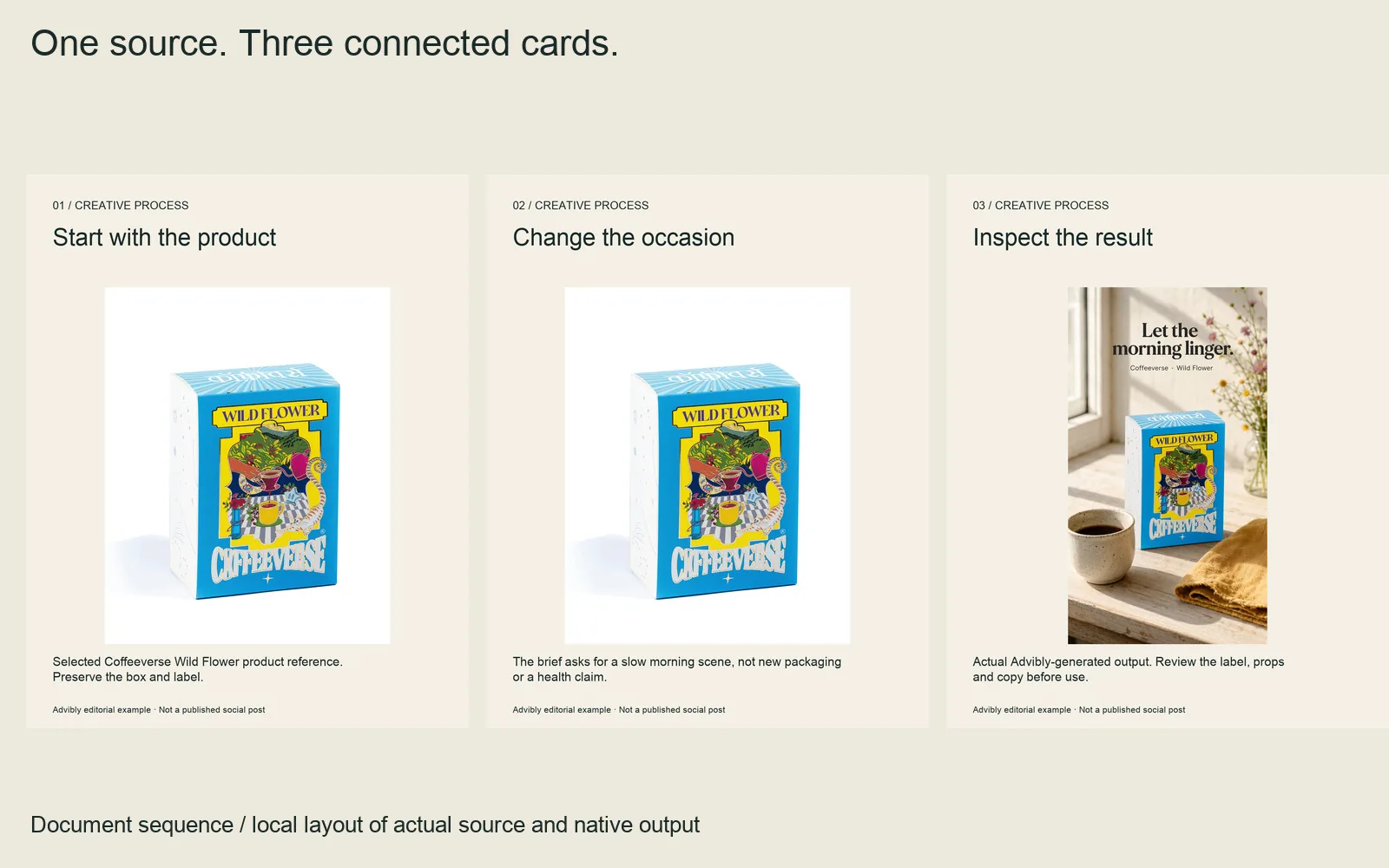
The same argument was laid out as three consistent 4:5 document pages, not stretched from the square cards.
Download the complete three-page PDF. This is a produced document specimen, not a LinkedIn upload test.
LinkedIn's document-upload guidance supports PPT, PPTX, DOC, DOCX and PDF, with limits of 100 MB and 300 pages. It recommends PDF and equal page sizes, says layered PDFs must be flattened or merged, and warns that embedded animation becomes static. Viewers can download the document as a PDF. The posted document itself can't be edited in place, although its description can be changed.
That makes the exported file the review target. A polished first slide isn't enough if page four has unreadable labels or the download exposes internal material.
Don't solve layered-PDF compatibility by blindly turning every page into an image. Keep text searchable and check its reading order, document tags and meaningful image descriptions. Adobe's PDF accessibility guidance explains why text and structure matter for assistive software. Recheck these after any export or layer operation; selectable text alone doesn't establish full accessibility.
Remove confidential content from the source and inspect the final file for comments, attachments, hidden material and sensitive metadata. Flattening is not a confidentiality audit. Don't hide a secret with a colored rectangle and assume it's gone.
A useful five-page document plan
For a fictional project-management app explaining a new approval view, a short sequence could be:
- Cover: “Find the review that's holding up launch.”
- Problem: one clearly labeled fictional example of a missing approval.
- Action: a real, approved screen capture showing the relevant control.
- Result: what the interface displays after the action, without invented business results.
- Next step: a link to the actual feature guide.
This is a proposed structure, not a claim that those screens or a published document already exist. Obtain the real captures before production. Give the document its own title and the post its own introductory copy; they serve different reading moments.
A finished creative-decision edit
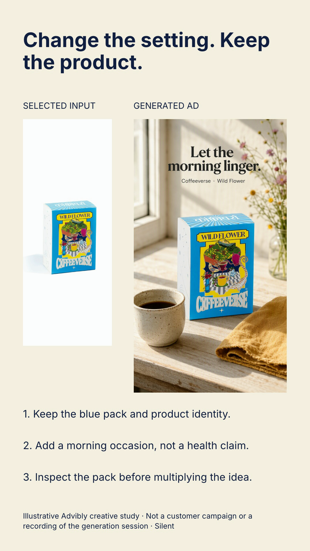
Open the exact creative decision poster image.
Watch the complete source-to-creative explanation (12 seconds, silent MP4)
The selected Coffeeverse Wild Flower packshot appears first; the actual Advibly-generated morning scene follows, with three staged decisions: retain the blue pack, add an occasion rather than a health claim, and inspect the product before multiplying the idea. This is a local editorial edit of the recorded input and output, not footage of the generation session, a brewing demonstration or a customer campaign. Reproduce the structure with your own authorized input and result, then verify the labels and full exported sequence. Its silence is intentional; the explanation is on screen.
Organic video: check the upload route
The dedicated Share videos on LinkedIn guide gives these requirements:
|
Parameter |
Direct-sharing guidance |
|---|---|
|
File weight |
75 KB to 5 GB |
|
Duration |
Up to 15 minutes; minimum 3 seconds on desktop or 2 seconds in the mobile app |
|
Resolution |
256 × 144 to 4096 × 2304 |
|
Aspect ratio |
1:2.4 to 2.4:1 |
|
Frame rate |
10–60 fps |
|
Bit rate |
192 Kbps–30 Mbps |
There's a documentation mismatch worth knowing: LinkedIn's article-media guide still lists a 10-minute mobile maximum. For an ordinary feed-video post, the table above follows the dedicated video-sharing page. Confirm the intended uploader if you're near a boundary; a connected publishing route can impose its own constraints.
Choose the composition before compressing. A portrait feed demo can use 1080 × 1350. A genuinely vertical subject can use 1080 × 1920. A wide screen recording can remain landscape when its interface would otherwise become unreadable. Exporting 9:16 doesn't guarantee placement in LinkedIn's immersive video feed; the dedicated guide says creators can't post directly to that feed.
Review the opening frame, custom thumbnail where used, caption accuracy and the message with sound off. Keep key information clear of interface overlays, but don't treat an invented pixel rectangle as a universal LinkedIn safe zone.
A worked export: the same image, a different composition
Here is the full portrait source behind the square crop. It is synthetic concept creative with no real beverage claim or brand endorsement.

Existing 1152 × 2048 Advibly campaign image. The unbranded can, orange circle, peach slices and paper arcs are generated concept art, not a photographed product.
The original is 1152 × 2048. A centered 1:1 crop uses a 1152 × 1152 region, removing 448 pixels from each end: 43.75% of the source area. The square above was then resized to 1200 × 1200. That extra output resolution does not add photographic detail.
For a 1200 × 628 landscape file, do not continue cutting until the can fits. Keep the full portrait on the left and give the message its own space on the right:
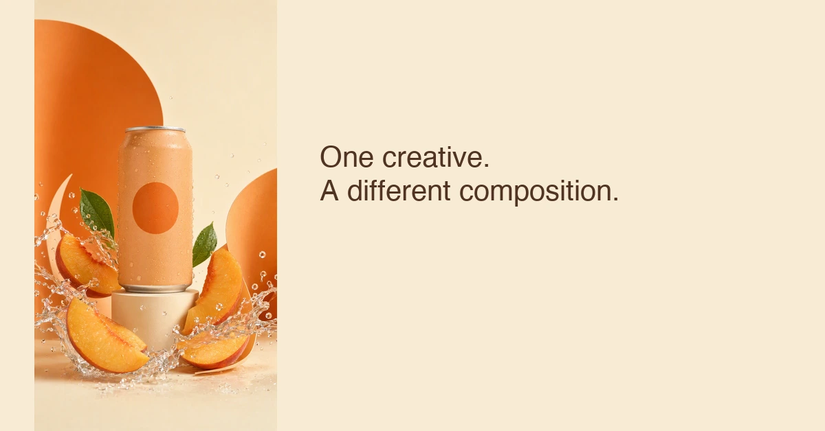
Actual 1200 × 628 editorial layout made from the intact Advibly source. The headline was added in a local design step, not by a native Advibly text-overlay tool.
At 628 pixels high, the 9:16 source needs about 353 pixels of width. That leaves enough horizontal room for a short headline without stretching the can. This is a different reading hierarchy, not a promise that landscape will outperform square.
To reproduce the decision: retrieve the approved source, duplicate it into destination-specific canvases, choose crop or fit intentionally, then read the smallest preview. Keep the files separate. A 1200 × 628 uploaded image and a fetched website preview do not share the same publishing controls.
A populated metadata study
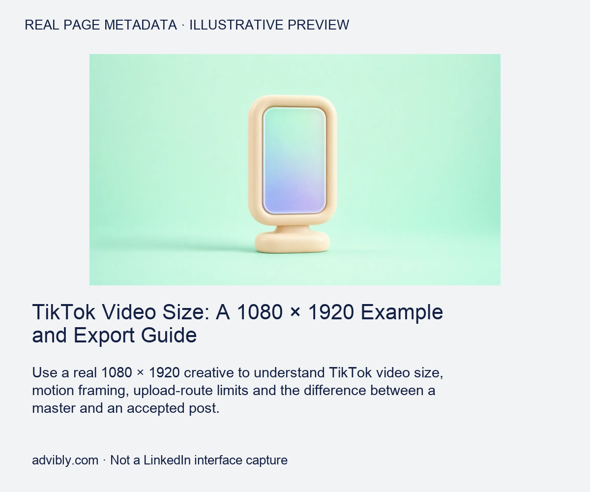
Open the exact metadata preview image.
This editorial card is populated from the saved title, description and image metadata of the actual Advibly page identified in the card. It is not a LinkedIn interface screenshot or proof of a fresh LinkedIn fetch. Compare the destination metadata with the real sharing preview before deciding whether the fault is the image or stale cached metadata.
Link-preview images: fix the page or the specific preview
A fetched website preview normally gets its title, description and image from the destination. LinkedIn's website-sharing guidance calls for Open Graph title, image, description and URL tags. Its sharing-module guidance lists a 5 MB maximum image file, minimum dimensions of 1200 × 627, and a recommended 1.91:1 ratio.
There is also a Page-admin path: super or content admins can customize a Page post's URL preview image and title. That local customization isn't a repair to the website's metadata for everyone else sharing it.
For a stale or incorrect fetched card:
- Check that you're sharing the intended destination URL.
- Inspect its current Open Graph image and confirm the image is publicly reachable.
- Correct the page metadata if it points to the wrong asset.
- Use LinkedIn's Post Inspector refresh process, then check a new post preview.
LinkedIn says the refresh affects new posts, not previews already attached to existing posts. Don't promise that repairing the website image will retroactively replace every old share.
If the post will become an ad, check it again
Organic acceptance doesn't certify a paid placement. For example, LinkedIn's single-image ad specifications recommend 1200 × 628 landscape, 1200 × 1200 square and 720 × 900 vertical. The page says paid vertical assets serve on mobile, and square or vertical ads can crop when shared organically.
Use the actual ad format's requirements and Campaign Manager preview when promoting the creative. An organic PDF document isn't automatically a paid carousel-ad file. Keep the paid brief separate.
From brand assets to a scheduled LinkedIn post
Start in Advibly with the product URL, real screens, brand library or previously approved creative. Keep the selected client's identity in its saved brand context. If the message needs development, use sourced Brand Intelligence to turn product information and audience language into a brief.
Then choose the deliverable. A feature announcement can become a static image; a process explanation can become a LinkedIn carousel; a real-screen demonstration can become an app explainer with narration and captions. Reuse the strong source material and generate only the missing supporting visuals. The same campaign can have related outputs without forcing every output into the same layout.
Advibly supports scheduling and publishing to supported connected LinkedIn member profiles and company Pages, with post-publishing status and analytics in the wider workflow. Choose the intended account and supported media format before scheduling. PDF creation, a queued post and a published post are separate milestones; inspect the selected route's result instead of assuming one proves the next.
The final check before and after posting
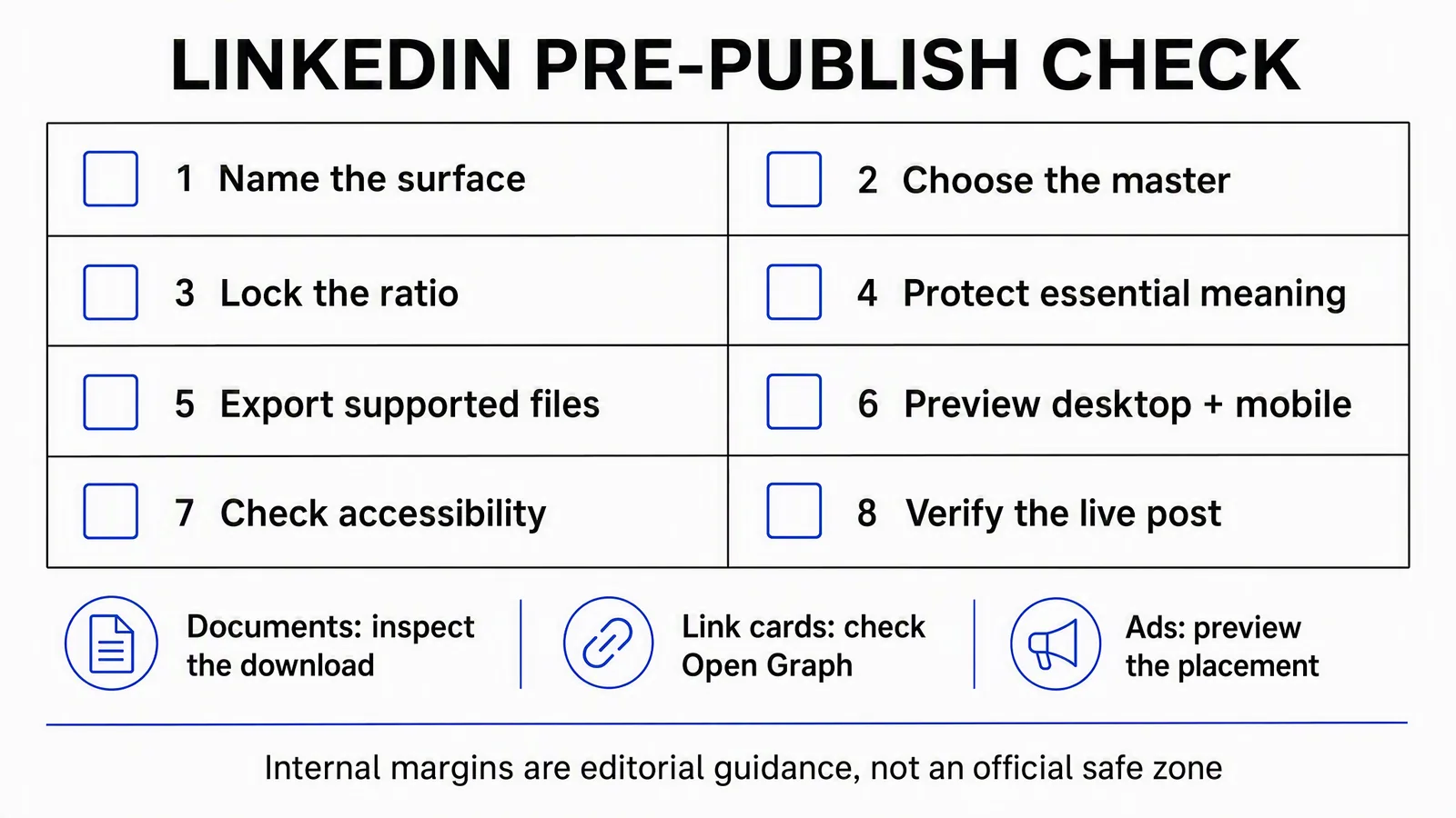
Internal margins are a design choice, not an official fixed safe zone. Steps one through seven are preparation; step eight happens after the authorized post is published.
Name the format and destination first. Confirm the export's ratio, file type and weight. Read the actual small preview, including the first image or document cover, and check the complete sequence. Supply useful image alternatives, accessible document content and accurate video captions as appropriate.
After publication, open the resulting post and verify the media, order, links and account. For a document, inspect the downloadable file too. If publication fails, diagnose the reported status before resubmitting; a second attempt shouldn't create an accidental duplicate.
Keep the final post linked to its approved asset version and review the available analytics against the campaign's purpose. Correct dimensions help deliver the message. They don't guarantee engagement, and they aren't a substitute for a message worth reading.
Generate your first creatives for free. Start with your own product source and starter credits; output quantity depends on the model and settings. Generation and social publication are separate decisions.