

A useful Instagram post idea connects one audience question, something you can show, and a next action. If shoppers can't tell what fits inside your desk organizer, show the compartments in use. If customers already own it, teach a setup. Those are different posts, even when they use the same product photos.
The 30 formats below cover six marketing jobs. Each includes a concrete starting point, the material needed to make it credible, and a reason to choose it. The sample hooks are proposed copy for hypothetical businesses, not quotations from real customers or reports of campaigns we ran.
Start with a product, then give each image a different job
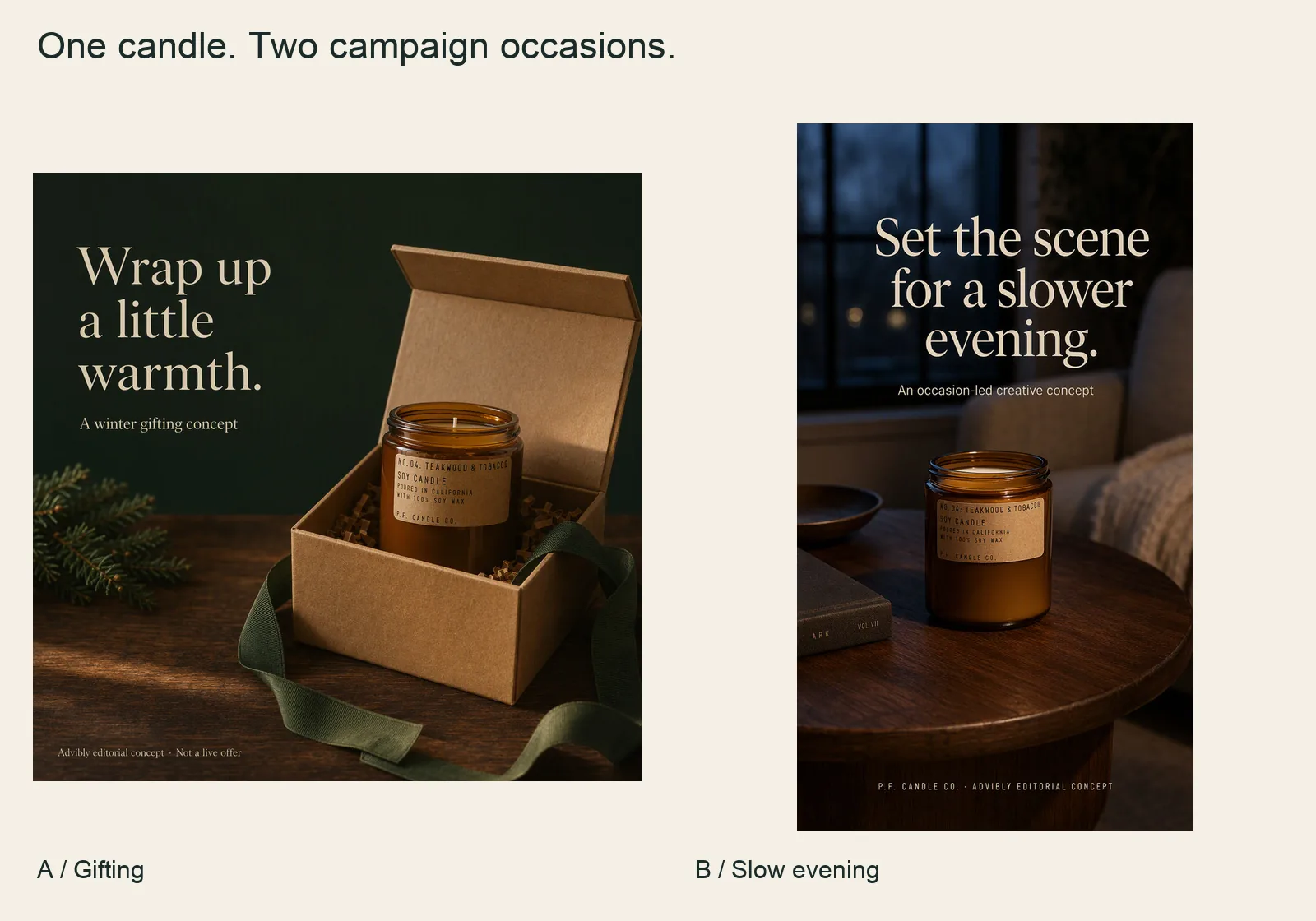
Two newly generated concepts from the same selected candle reference: gifting and a slower evening. The comparison is about campaign occasions, not a new product, real offer or customer experience.
P.F. Candle Co. Teakwood & Tobacco Standard Candle product source
Use the gifting image for an explicitly conceptual seasonal direction; use the evening image to discuss atmosphere; use the pair to ask which direction to develop. These are different editorial jobs, not three posts that were published.
Across the ideas below, the apparel collage, coffee offer specimen, pet question and product-source pairs make other approaches visible. Real customer stories, tests, interviews and provenance cannot be filled with synthetic stand-ins.
Bring your cleared source into Advibly, request the specific scene or layout, and inspect the generated product and text. Generate your first creatives for free; starter credits are not a free publishing plan.
Choose the job for your next Instagram post
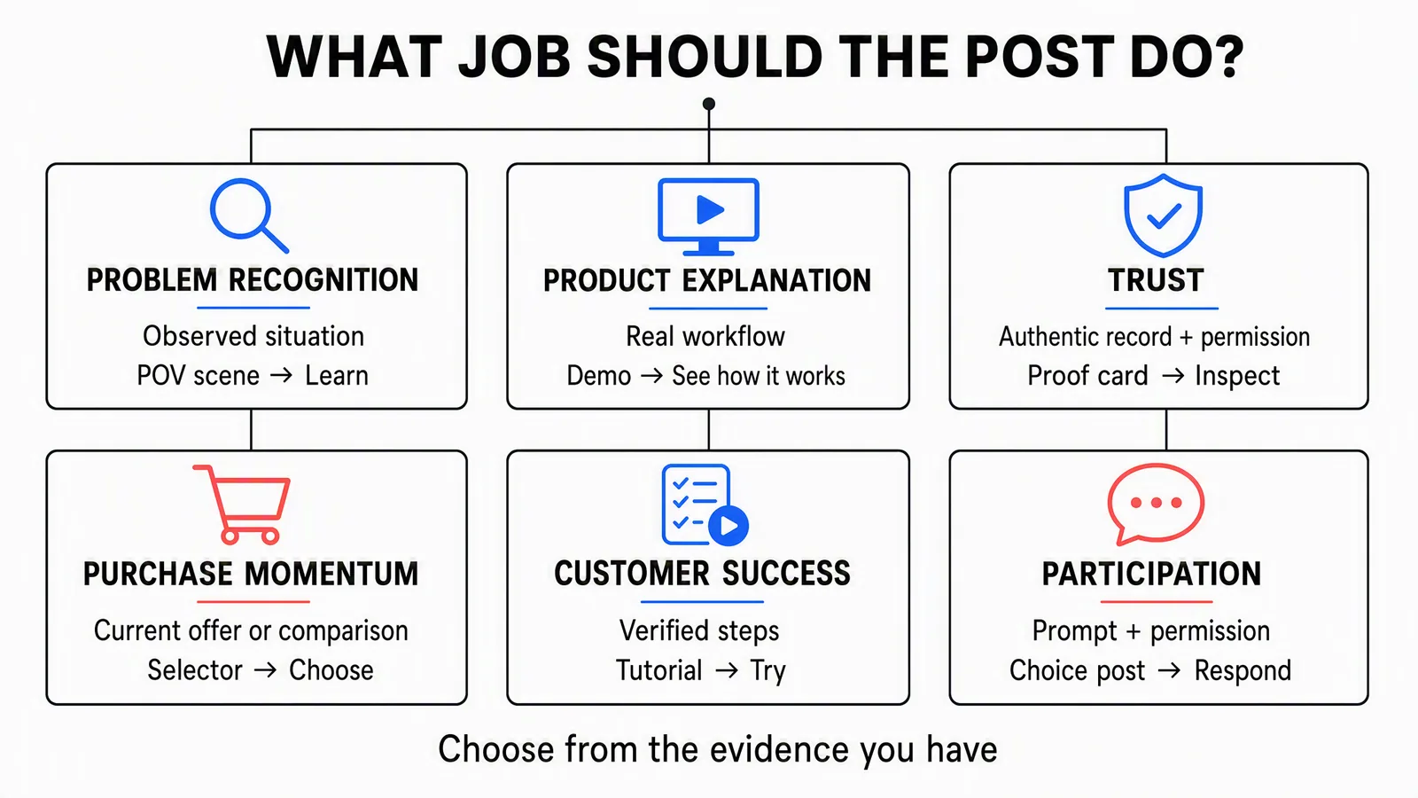
An editorial selector, not an Instagram algorithm model. These jobs can overlap; choose the main audience decision for this post.
|
The audience needs to… |
Start with… |
|---|---|
|
Recognize a problem |
Ideas 1–5: a familiar scene, a decision or an observed workflow. |
|
Understand the product |
Ideas 6–10: a use case, feature, selector, unboxing or demonstrated answer. |
|
Decide whether to trust it |
Ideas 11–15: authentic customer records, design decisions or comparable evidence. |
|
Make a purchase decision |
Ideas 16–20: a release, bundle, objection answer, offer or product destination. |
|
Use the product successfully |
Ideas 21–25: onboarding, technique, care, a recipe or an update in use. |
|
Participate |
Ideas 26–30: a specific contribution, spotlight, response, choice or interview. |
Short on assets? Start with something your library can support. Real packshots and specifications can make a selector. A verified screen recording can make a feature demo. Without customer permission and source files, don't manufacture a testimonial; choose a product explanation instead.
1–5: Make the problem recognizable
1. A POV trigger scene
Hook: “The brief says ‘make it pop.’ The deadline is today.” The scene needs a trigger and an unblocking action, not just an attractive setting.
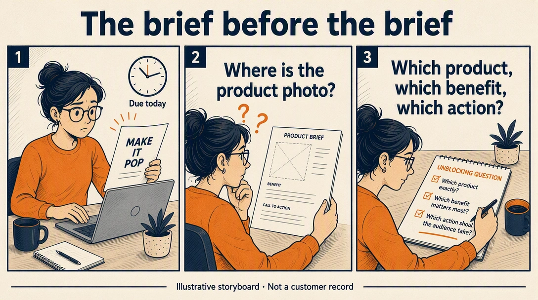
This generated storyboard shows the actual mechanism: an ambiguous request, a missing product photo, then three briefing questions. It is a dramatized scene, not a customer record.
To reproduce it, specify what the person sees first, what essential input is missing and the concrete question that changes the next action. Keep the same character across panels. Use recurring situations or clearly labeled dramatization; do not claim how often all teams experience it.
2. A myth-to-decision carousel
Try a misconception that the available evidence can actually challenge: “A prettier scene proves more about the product.” Our BAGGU concept makes the distinction visible without inventing product measurements.
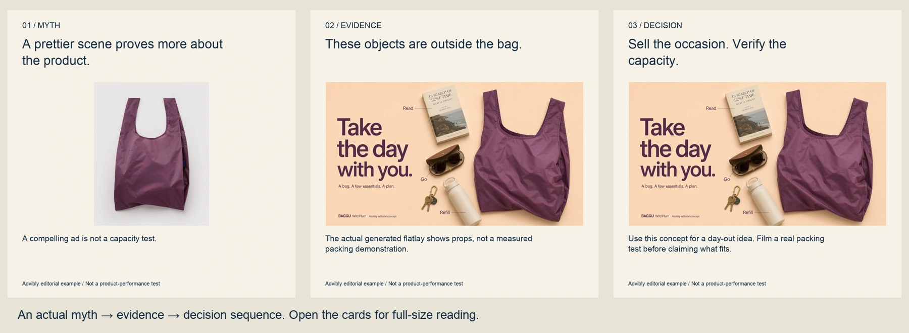
Myth: an attractive ad establishes more product capability. Evidence: the generated objects are outside the bag, not a demonstrated load. Decision: use the scene to sell an occasion and obtain a real packing test before claiming capacity.
Open the actual cards: myth, evidence, decision. The input is the selected product photo; the evidence card uses the actual native-generated flatlay.
Build each card around one step in the argument, then verify that the middle card genuinely supports the conclusion. Do not replace evidence with another slogan. This is a proposed creative-production argument, not a finding about what customers believe.
3. A category explainer with a non-fit
“A review tool isn’t another chat room.” Explain the category through the work it organizes: a marked-up file, specific feedback and a decision attached to the version.
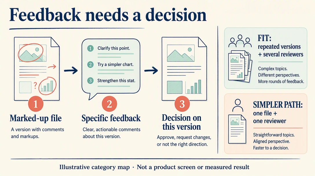
The diagram teaches that distinction and a non-fit: repeated versions with several reviewers versus a single file with one reviewer. These are illustrative decision conditions, not invented software screens or a measured speed comparison.
Use conceptual objects when teaching the category; use real screens when claiming a particular product performs the action. Invite viewers to inspect the workflow and choose the simpler process when it is enough.
4. An old-workflow map
Ask “Where does the approved file go?” Follow the handoff, not a vague promise of better collaboration.
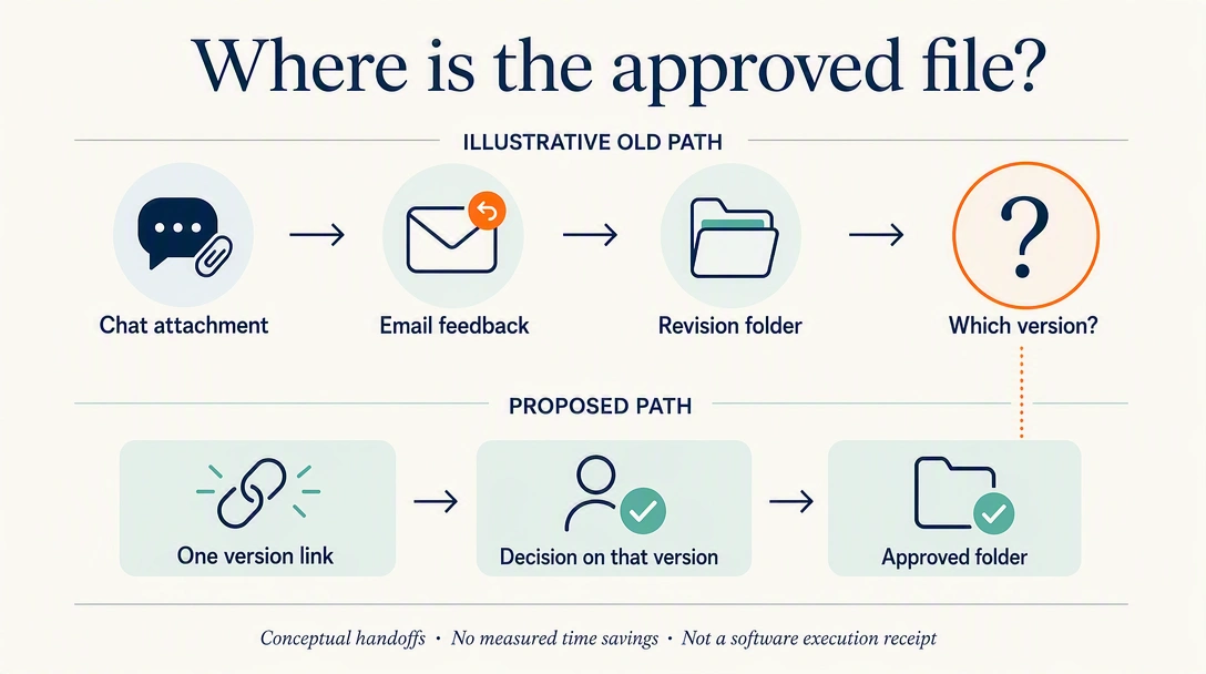
The illustrative old path ends with “Which version?” after chat, email and a revision folder. The proposed path keeps a version link, its decision and the approved folder connected. The highlighted handoff is the problem being explained.
To reproduce it, map observed steps or label a hypothetical path, circle one failure point and draw the revised path beside it. Ask which handoff the reader would remove. Add time or cost savings only after measuring them under a stated method.
5. A founder belief tied to a decision
“We removed a feature customers expected.” Explain the tradeoff, show the actual design change, and say who benefits or loses out.
Bring a prototype, decision note or current product detail. This works when the belief changed something tangible; otherwise it becomes a motivational quote. The next action is to inspect the resulting product, not applaud the founder.
6–10: Explain the product
6. One product inside one routine
“Where does each tool go?” Show an untidy desk, the same objects moving into a real organizer, and the finished setup. The value is understanding the use, not watching a packshot rotate.
Photograph the actual compartments and avoid hiding objects between frames. End with “Inspect the layout.” For a real-brand reference, Shopify describes Pistakio's product-use content showing how the spread fits into familiar routines. That's a documented content pattern, not a sales benchmark. See the example.
7. One feature completing one action
“Approve this version without losing the feedback.” Record the current app, highlight the decisive control, then show the resulting state. Unlike idea 6's whole routine, this post teaches one feature's mechanism.
Use real screens and permitted account data. Advibly can build an app explainer around supplied screenshots, with narration and captions; a screenshot sequence isn't proof of unrecorded functionality. Ask the viewer to try the action, and state any prerequisite they need.
8. A three-way selector
“Baby, Standard or Big?” A useful selector compares real alternatives on the same criterion, not three styled views of one product.
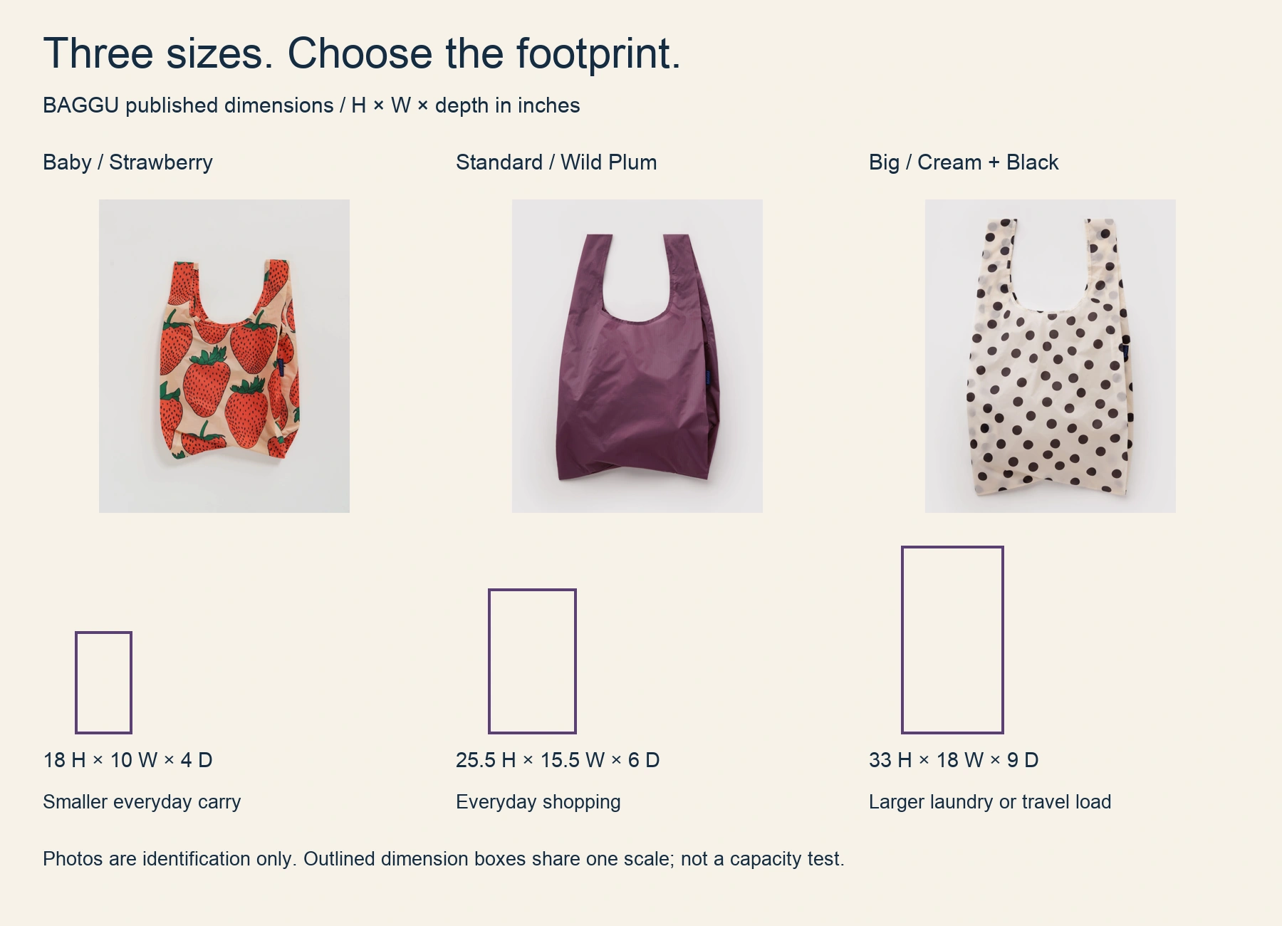
The real Baby, Standard and Big BAGGU variants are identified above. Manufacturer dimensions drive the outlined boxes at one scale; photographs identify the products and are not a measured capacity comparison.
Compare published H × W × depth: Baby 18 × 10 × 4 inches; Standard 25.5 × 15.5 × 6; Big 33 × 18 × 9. Choose around the space and load you need, then inspect the exact product. Do not infer what fits from a differently scaled photograph.
Baby Strawberry source · Standard Wild Plum source · Big Cream and Black Polka Dot source. Dimensions checked September 12, 2026; this is an editorial comparison, not brand endorsement.
9. Unboxing with decision cues
“What arrives, and what still needs setting up?” Show the sealed package, included parts, assembly requirement and finished product.
Film the current package for the relevant market. Distinguish included items from styling props and separately sold accessories. This is for buyers evaluating the purchase; the onboarding post later in this list is for people who already own it.
10. A demonstrated FAQ
“Will the cable still reach with the stand raised?” Show a real device, cable length and setup, then the answer under those conditions.
Use a genuine buyer question and a demonstration that can answer it. A different device or accessory may change the result, so name the tested configuration. Direct the viewer to compatibility details rather than declaring universal fit.
11–15: Establish trust
11. A customer workflow story
Follow one consenting customer through the problem, the change they made, and the result they can substantiate. A proposed title might be “How one studio organizes final client files.”
Collect the originals, dates, permission and the customer's explanation. Show their actual process, including what the product didn't solve. This is a documented case, not a decorative testimonial or a promise of typical results. Link to the fuller account.
12. A review connected to a product detail
Choose a real review about a specific feature, then photograph that feature. A comment about finding tools easily could sit beside a real compartment layout, without being rewritten as a measurable productivity claim.
Keep the quotation accurate and verify reuse rights. Make it easy to identify its source and context. If the review is vague, don't invent a supporting story. An AI presenter can explain a feature, but must not impersonate the reviewer or claim their experience.
13. A behind-the-scenes decision
“Why this package has an insert.” Show the actual design choice, the alternatives considered and the tradeoff it addresses. Use real process material rather than stock factory footage.
Shopify's editorial examples describe Dieux's packaging explanations and Damson Madder's campaign making-of content. The transferable structure is explaining a specific choice, not borrowing either brand's claims. Dieux reference, Damson Madder reference.
14. A provenance trail
Trace one component from the named source through production to the finished item. Show a supplier record, the relevant process and the exact product version.
Explain what the records establish. A photograph of a workshop doesn't establish every material's origin or an environmental certification. Invite viewers to read the supporting product information; omit any step you can't verify.
15. A matched before-and-after
For an organizer, photograph the same desk and objects before and after arranging them. Keep the viewpoint comparable and account for anything removed from the scene.
Preserve originals, describe the intervention, and avoid implying the product did work performed by someone else. Generated “after” imagery cannot substantiate a real customer's transformation. If you can't make a fair comparison, use a step-by-step setup instead.
16–20: Help someone make a purchase decision
16. A launch with three answers
Answer what changed, who can get it, and where. “The travel case is now available in the larger size” is more useful than an unexplained “It's here.” Show the exact released item and destination.
Launch-format specimen
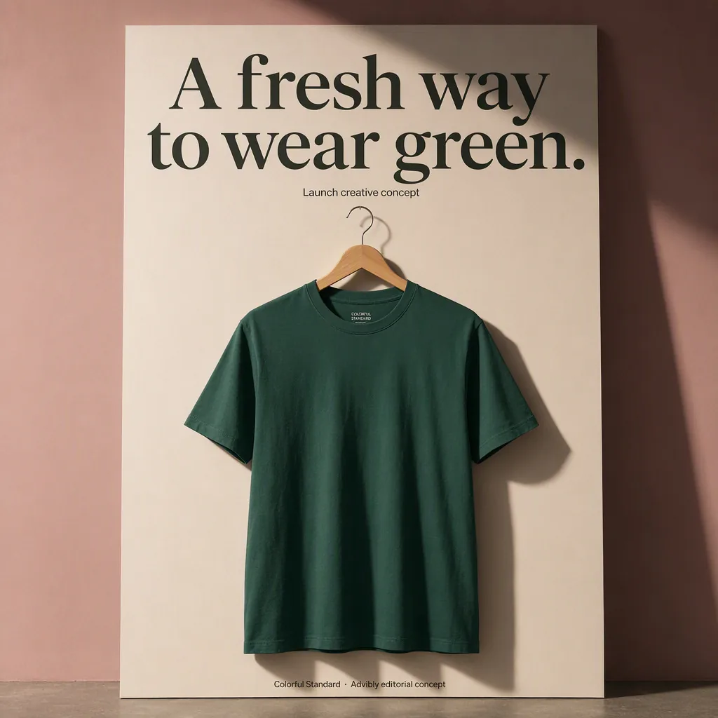
The poster is explicitly a launch creative concept. It does not announce a real new release, availability window or inventory count.
Shopify documents Fly By Jing announcing retail availability as this kind of content. Treat that as an announcement example, not confirmation of today's inventory or a performance result. See the reference. Recheck your own offer before the scheduled post goes live.
17. A bundle by job
For reusable-bag gifting, show the actual set and explain what belongs to the order. This is different from arranging attractive props around one bag.
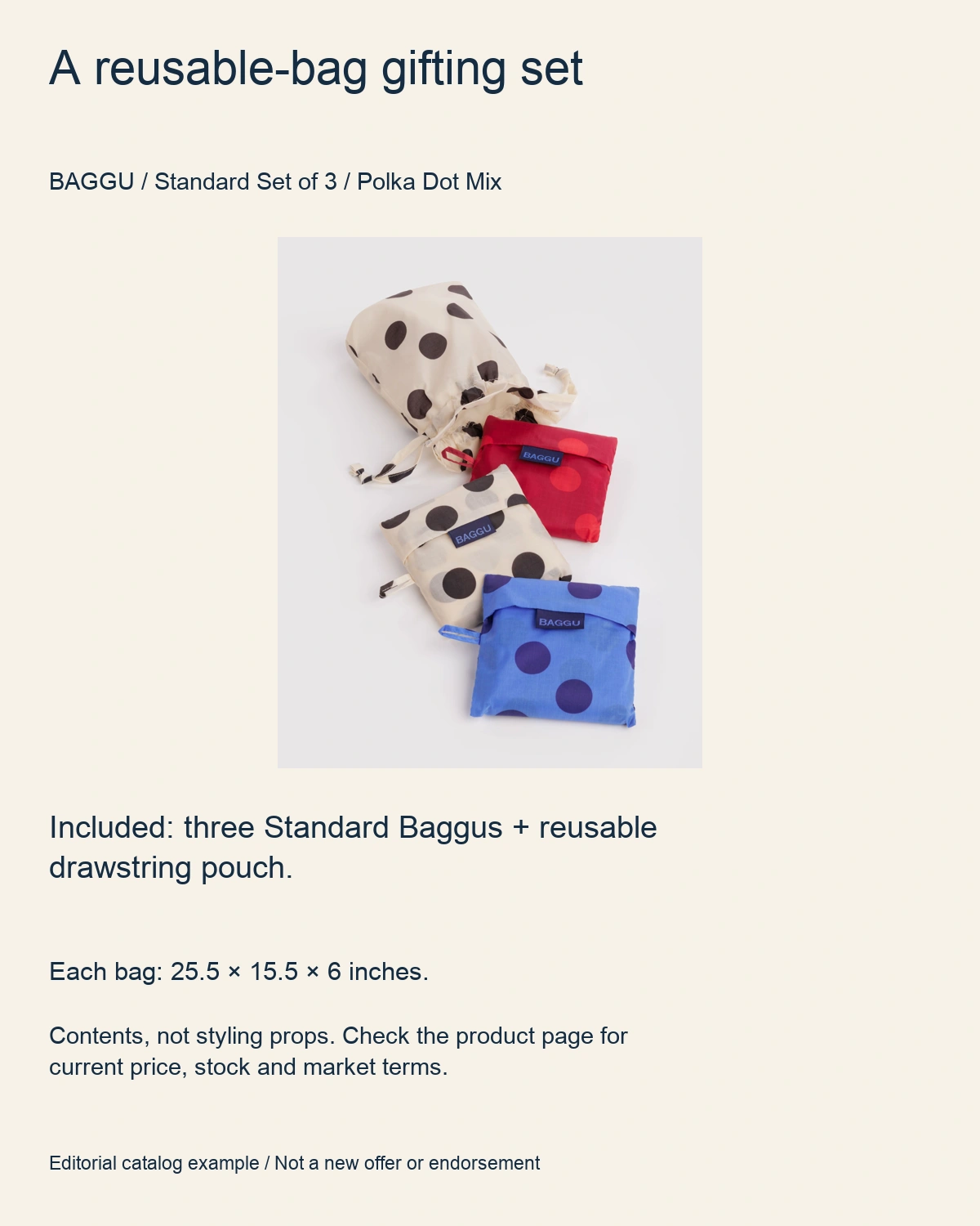
The actual BAGGU Polka Dot Mix catalog image shows the set. The manufacturer lists three Standard Baggus and a reusable drawstring pouch; each bag measures 25.5 × 15.5 × 6 inches. No extra styling props are counted as included.
Inspect the exact set and current terms. Contents checked September 12, 2026. This editorial specimen does not announce a discount or guarantee inventory, price, shipping or availability in every market.
Reproduce the structure with your cleared set photo, a literal inclusion list and the verified product destination. Keep separately sold essentials out of the inclusion list and recheck commercial terms before publishing.
18. An objection answered with evidence
“Will it fit a shallow desk?” Show the organizer beside a ruler and the working space left for a keyboard. Use a real question from sales or support, not an objection invented because it's easy to defeat.
Keep the measurements and camera perspective clear. If the fit is marginal, say so and show the smaller option. Direct viewers to the dimension guide, not an unsupported reassurance.
19. An offer breakdown
Make one clear card: included products, total price, meaningful exclusions and a real closing date if there is one. Follow it with the customer condition that makes the offer useful.
Offer hierarchy without a fake promotion
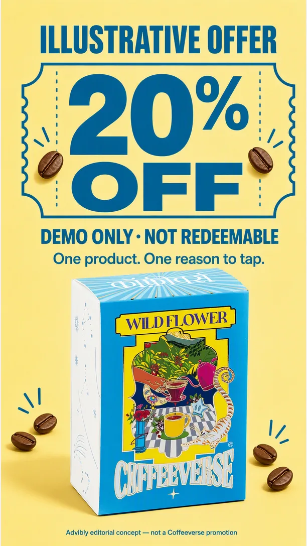
The 20% figure is illustrative and not redeemable. The disclosure is inside the image as well as here.
Use approved commercial information and check the landing page. Don't let a later caption contradict the main graphic or let an old discount survive in a scheduled asset. The action is to view the current offer, not respond to manufactured urgency.
20. A product hero with a working destination
Show one product clearly, with the relevant variant and buying detail. A beautiful lifestyle scene needs a legible product, not a collection of unrelated props.
Product hero

Inspect the exact ARATA Hydrating Body Milk product. This verified product destination accompanies the generated editorial hero; it is not a functional Instagram product tag.
Use product tags only where your account, catalog, market and publishing route support them; otherwise choose another available destination. Shopify's commerce guide describes eligible product-tag workflows. Verify the actual destination and offer instead of assuming a tag in the design is functional.
21–25: Help existing customers succeed
21. The first successful action
“Your organizer arrived. Start with the three things you use every day.” Show where those objects go, then the completed setup. For an app, show the first completed customer task rather than every settings page.
Use current instructions and a visible finish state. Tell the owner what to try next. If account setup or assembly is required first, say so; don't leave a new user stranded before step one.
22. An advanced technique with prerequisites
Teach an app user how to duplicate an approved layout and change only its content. Open with the existing layout, perform the reuse step, and inspect what changed.
Record the actual supported workflow and name the required access. Show one recovery action if the copied version carries stale information. This serves established users, unlike idea 7's introduction to a feature. End with a specific task to try.
23. A care checklist
Turn the exact manufacturer’s guidance into a saveable card. Here the real Wild Plum Standard BAGGU packshot identifies the recycled-ripstop-nylon item the instructions concern.
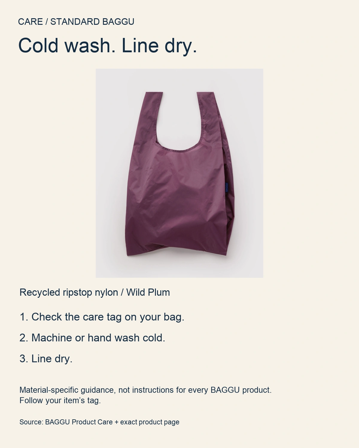
BAGGU’s nylon guidance says to machine or hand wash cold and line dry. The care card retains the instruction to check the item’s own tag; it does not apply the same care to leather, canvas or every other bag.
Manufacturer care guidance · Exact product and material. Checked September 12, 2026.
Use the genuine material or part image, retain version-specific warnings and link the source. Do not improvise chemical compatibility, safety, warranty or medical advice.
24. A three-step workflow recipe
Show “Choose the tools, assign the compartments, reset the desk.” Give the viewer a repeatable sequence, not merely a finished arrangement. The distinction from idea 6 is that the steps themselves are the takeaway.
Shopify describes Pat McGrath's product-supported technique tutorials as an example of teaching through product use. See the reference. For your own recipe, verify the method and materials, then ask viewers to try the sequence.
25. An update shown in use
“What changed in the review screen?” Put a real old path beside the released new path and show the task a customer can now perform differently.
Use dated captures, current release information and the actual eligibility conditions. Don't present a beta or staged rollout as available to everyone. Point affected customers to the update or setup instructions; everyone else should understand when it applies.
26–30: Invite participation
26. A constrained UGC prompt
“Show the three objects always on your desk.” The visible sample should teach framing and constraints, not substitute a preference question for the requested contribution.

This illustrated sample shows a notebook, pencil and ruler from overhead. The brief specifies one photo, three objects, no faces and no private screens. It is a reusable planning example—not a customer contribution or live collection.
Before running this invitation, supply a tested submission route, explain who receives the file and agree separately on reposting, editing or advertising rights. No collection endpoint or permission has been established by this article, so this specimen deliberately does not ask readers to upload anything.
To reproduce it, make your own cleared sample shot, set the smallest useful constraint and test the intended route. Tagging a brand is not blanket permission to reuse a photograph.
27. A customer spotlight
Introduce a consenting customer's particular setup: what they keep nearby and why. Unlike the workflow case in idea 11, this is a portrait of use and identity, not a claim that the product caused a business outcome.
Shopify describes Starface sharing customer-use content. See the reference. For your spotlight, use authentic material, retain context and ask permission for the intended use. Invite others to describe their own setup.
28. A structured response or remix
Publish a cleared starter layout and ask, “What would you move first?” Specify which elements people can change and how to submit their response.
A visual seed to reinterpret
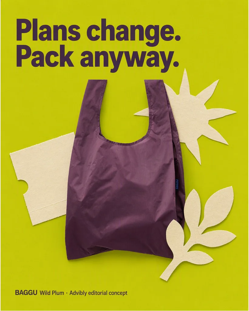
This is the actual supplied editorial collage specimen. Borrow the distinction between a realistic product and graphic surroundings; use your own cleared product instead of implying this brand endorses a remix.
Use a downloadable image, reply prompt or supported native mechanic that participants can actually access. Clarify both their allowed use of your seed and your intended reuse of their contribution. Don't promise native remix controls without checking the chosen format.
29. A choice the team will act on
“Which divider would help: wider or removable?” Show two real prototypes under comparable conditions and explain the decision the feedback will inform.
Collect reasons as well as votes. Then publish what you decided and why, including constraints that outweighed the tally. Don't present an informal audience poll as representative market research or ask for a choice you've already closed.
30. A collaborator interview
Ask a designer: “What problem did you start with? Which option did you reject? What should buyers notice?” Cut the answers around the actual product details mentioned.
Shopify describes Sabai Design interviewing its founder and designer about a collection's development. See the reference. Get agreement to record and reuse the interview, retain the speaker's meaning, and disclose relevant relationships. Don't generate a fictional interview and label it genuine.
Fill one production card before opening the calendar
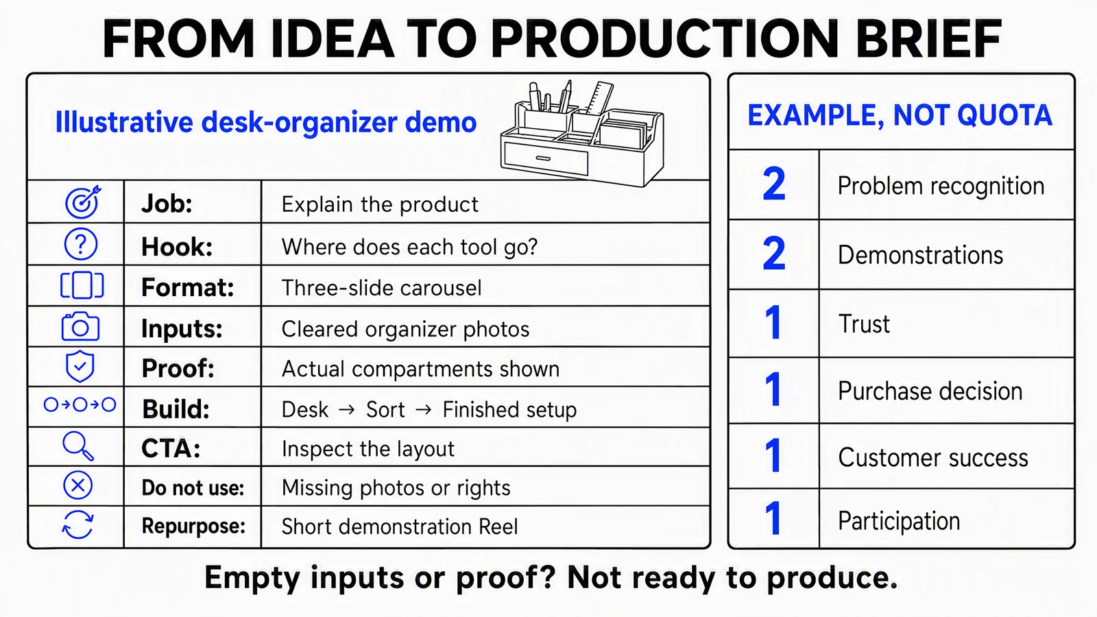
A proposed brief, not an executed product test. Cleared photos and actual compartment evidence are required inputs, not assets or permissions established by this illustration.
Use idea 6 to make the desk-organizer example concrete. This fictional brief carries the same nine fields as the diagram:
|
Field |
Filled example |
|---|---|
|
Job |
Help a prospective buyer understand where everyday tools fit. |
|
Hook |
“Where does each tool go?” |
|
Format |
Three-slide Instagram carousel. |
|
Inputs |
Cleared photos of the same real organizer, desk and stationery; current dimensions. |
|
Proof |
Actual compartments and objects visible, with no generated extra storage. |
|
Build |
Slide 1: desk and loose tools. Slide 2: tools assigned to compartments. Slide 3: finished setup and a layout detail. |
|
CTA |
“Inspect the layout.” Use the product destination supported by the account and post. |
|
Do not use when |
Source photos or rights are missing, or the arrangement hides objects that don't fit. |
|
Repurpose |
A short demonstration Reel, using real footage if it claims to show the sorting action. |
Keep the distinction between layout adaptation and evidence creation. Advibly can build the carousel from brand context and reference assets. If a new scene changes the product's compartments, reject or correct it. A convincing generated image doesn't expand the product's capacity.
Turn the card into a small, job-balanced plan
The diagram proposes eight posts: two problem-recognition posts, two demonstrations, and one each for trust, purchase, customer success and participation. Adapt the formats to one desk-organizer campaign as below; the designer and file-approval examples in ideas 1 and 4 are starting mechanisms, not scenes to copy into it. This is not a recommended universal posting frequency:
|
Pair |
Proposed posts and dependency |
|---|---|
|
1 |
Adapt idea 1: someone can't find the ruler on the desk. Follow with idea 6's organizer routine, using the same cleared desk and objects. |
|
2 |
Adapt idea 4: map tools moving between drawers during a task. Follow with idea 8's configuration selector. Use observed steps and real measurements. |
|
3 |
Idea 13's design decision, then idea 18's fit objection. Gather process records and the measured setup. |
|
4 |
Idea 21's customer setup, then idea 29's divider choice. Use current instructions and a decision still open. |
If the process evidence isn't available for pair 3, change that slot. Don't generate fake provenance to preserve the calendar. Conversely, several usable source assets can support one connected story without becoming eight near-identical product heroes.
Before publication, write down what you will look for afterward. A tutorial can be reviewed for saves and recurring support questions; a selector for fit questions and relevant destination visits; a participation post for usable responses. Review the metrics actually available alongside the comments and linked destination data. None of these signals alone proves sales impact or why a post performed as it did.
Check rights and platform features at the production step
For borrowed photos or customer material, record the source and the allowed use. Credit, possession of a file and permission are different things. The U.S. Copyright Office's guidance distinguishes ownership of a photo from owning its copyright and advises obtaining permission when in doubt. These checks aren't a rights clearance for a particular campaign.
For paid, gifted or affiliate creator content, follow Instagram's branded-content guidance on the paid partnership label. For U.S.-directed endorsements, the FTC's disclosure guidance also calls for clear, conspicuous relationship disclosure with the endorsement. Don't assume a platform label alone is sufficient, and don't attribute experiences to someone who hasn't had them.
Instagram's music guidance distinguishes its personal-use licensed library from Sound Collection's commercial-use options. Check the actual track's terms and destinations before repurposing a video. A trending sound is not automatically a commercial license.
Finally, check the chosen composer and account before depending on product tags, collaboration or branded-content features in a scheduled post. Instagram's scheduling guidance flags feature restrictions in its native mobile workflow; that isn't a blanket specification for every integration. Meta help text was reviewed through indexed copies on September 12, 2026 because direct access required login. Recheck the live workflow for the actual post.
Create, schedule and learn from the selected posts in Advibly
Start with your saved brand context, product page, app listing, real screens or approved creative library. Use Brand Intelligence to develop a sourced brief when the audience question needs research. Keep each client's brand and source assets separate.
Then choose the output the idea needs. Build a carousel for a selector, a product scene for a launch, an app explainer from real screens, or a presenter-led video for an explanation. Reuse the campaign direction across assets, with captions and copy adapted to each format. When the claim depends on a real customer, physical test or actual software behavior, bring that evidence into the workflow rather than generating a substitute.
After review, schedule and publish supported Instagram posts to the correct connected account. Keep the approved file, caption and destination together; distinguish scheduled, processing and published status. Advibly's post-publishing analytics can support the review alongside the job-specific signals you selected.
For an educational post with a useful guide, a proposed CTA could be “Comment DESK and we'll DM you the setup guide.” First create the promised guide and its working destination. Configure Advibly's Instagram comment-to-DM flow with that keyword, destination and button wording on the relevant supported post. Direct link delivery and a follow-check flow are available options; choose the experience deliberately. Configuration can happen on a scheduled post, but it isn't proof a reader has received the message. This is post-comment automation, not a general Story-reply or cold-DM bot.
Pick one job, fill its card and produce that post well. The reusable part is the brand context, source library and production method. The audience question should still earn each new post.