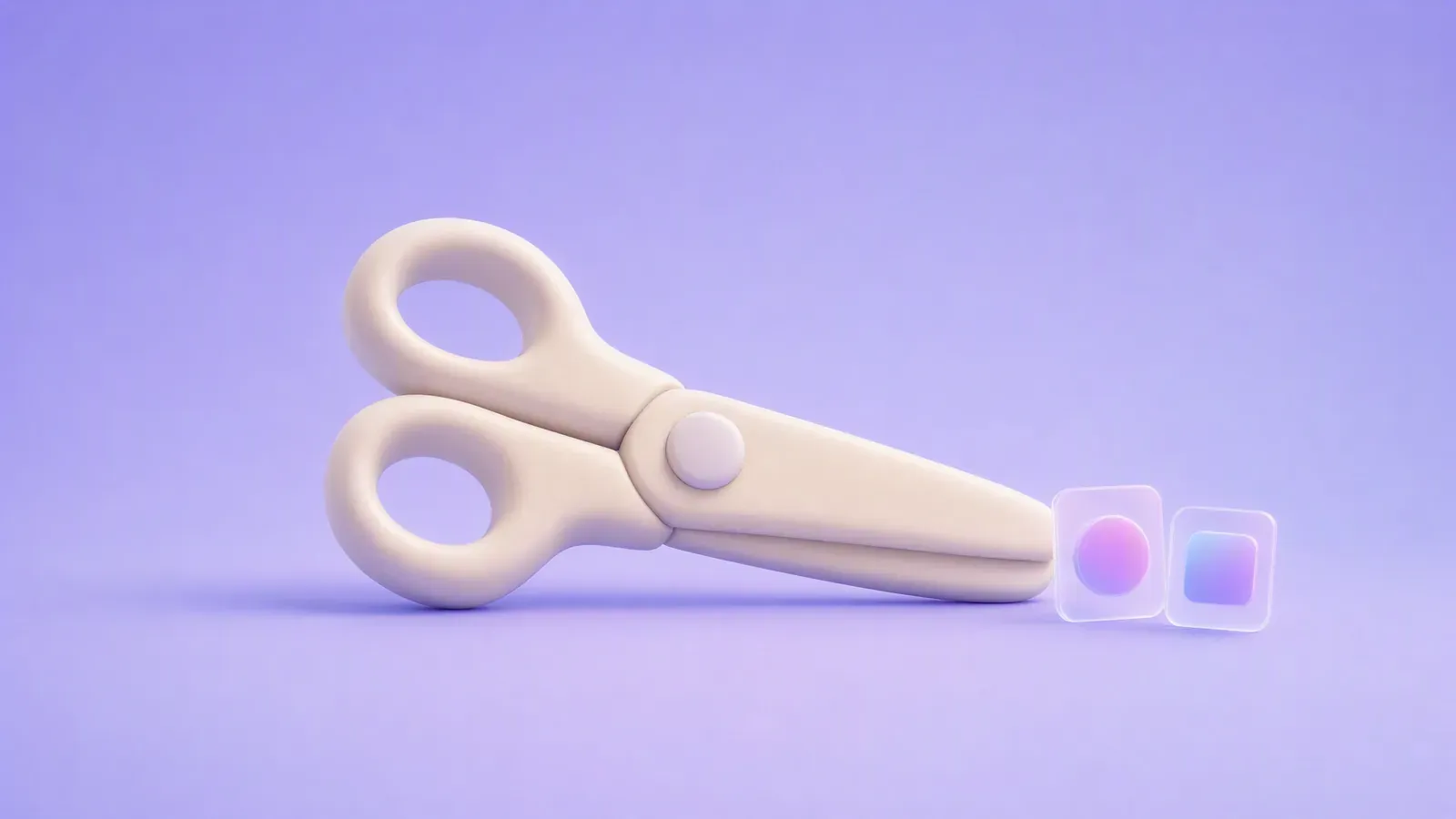
Cutout animation makes movement from separate flat pieces: paper, card, photographs or digital artwork. The important choice is whether you need actual handmade material, controllable digital pieces or only the appearance of a layered scene.
Start with this existing Advibly-assisted collage project: a separate pouch component, a composed still and the animated result. It is digital cutout-style work, not photographed paper stop-motion.
Inspect the pieces before watching the motion
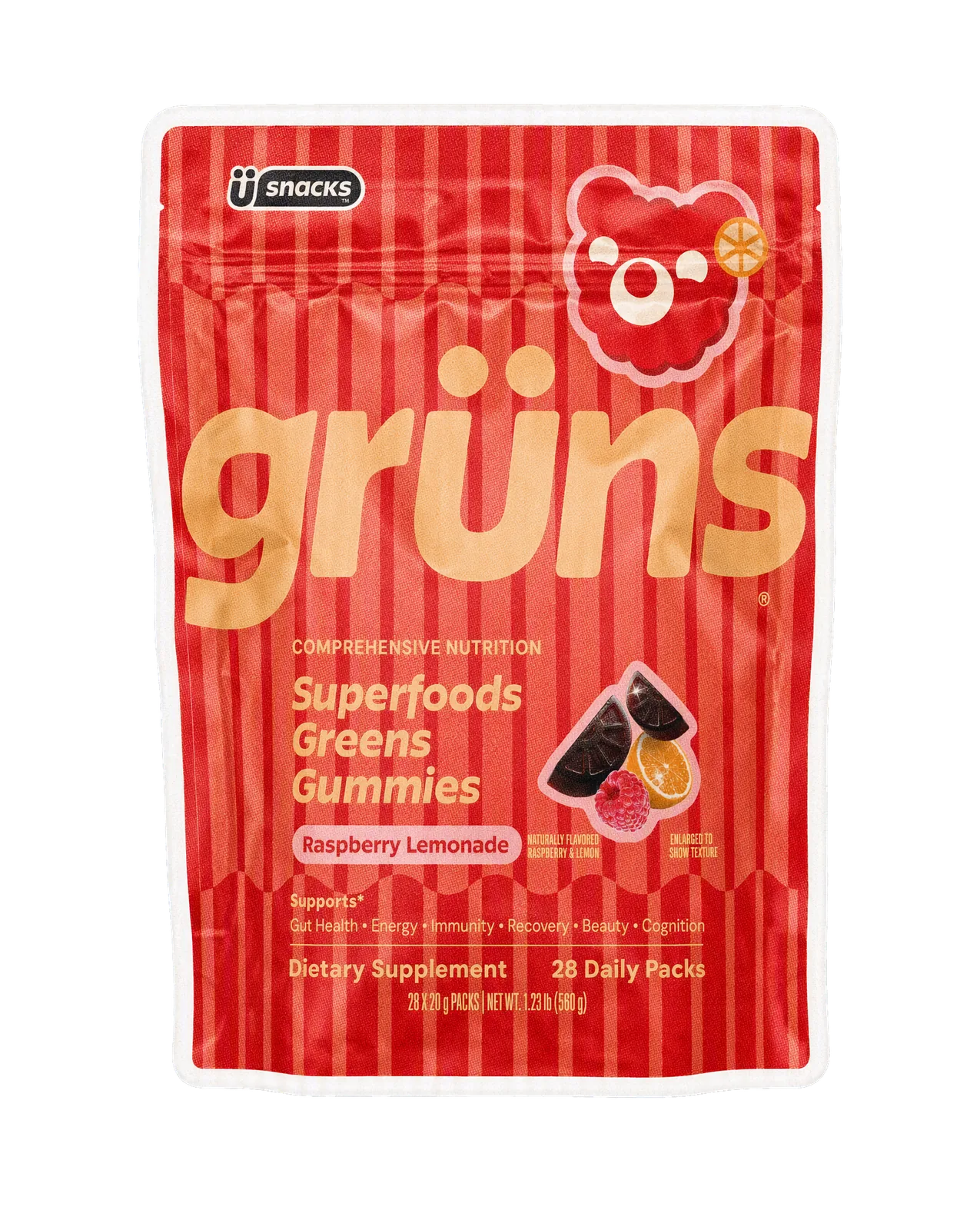
The product-shaped piece above is an actual generated component from a Grüns-inspired spec project. It has a cut-paper-style edge. This is not an untouched retail packshot, and the project is not evidence of a customer relationship.
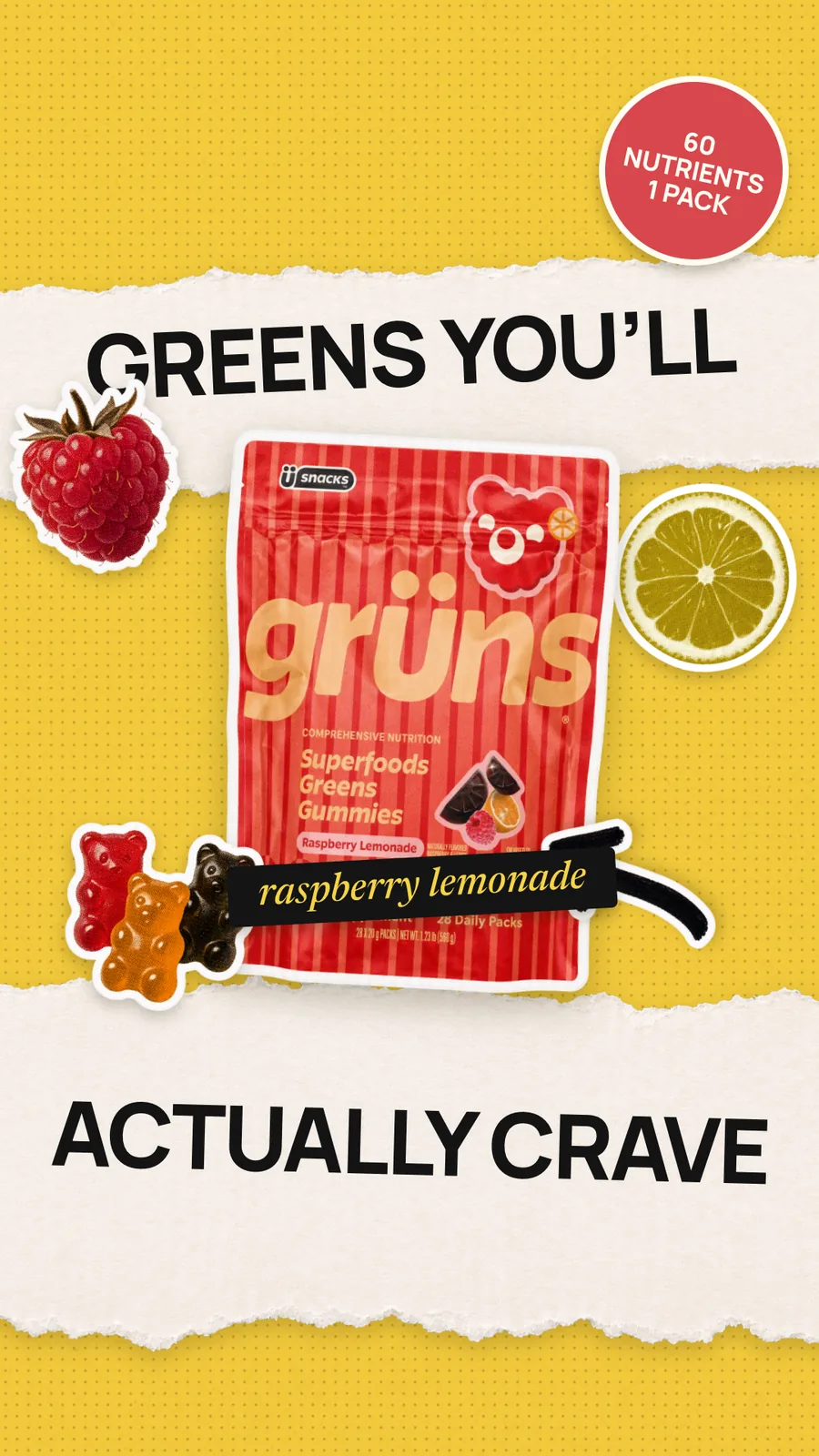
The completed still combines the pouch, fruit shapes, paper texture and separate headline pieces. The image proves that a composed artwork exists; it does not prove that the file itself contains editable layers. The promotional wording and nutrient badge are specimen copy, not claims verified by this guide.
Watch the actual six-second collage motion output (MP4). Look for small movement around the product and the paper-like staging. The appearance is stop-motion-inspired; the clip was generated from the assembled still through Advibly rather than captured one paper frame at a time.
How this example was made—and what to reuse
The production used Advibly-generated pieces, local background removal and compositing, then passed the assembled still back as the animation reference. The source project records separate pouch, fruit, paper and typography elements. Local compositing supplied exact layout control; this is not a claim that Advibly exports a native editable cutout rig.
- Choose what must remain exact. For a real product, start with cleared, accurate product material; do not assume a generated label is faithful.
- Keep the product, scenery and type separate during assembly. Give each its own movement or replacement only when the shot needs it.
- Make the still readable first. Use the finished composition as the motion reference and request restrained, locked-camera motion if layout stability matters.
- Inspect the returned clip. A drifting label or changing badge is a production failure, not charming handmade variation.
Borrow the method, not the supplement copy. Before any real campaign, replace specimen claims with approved product facts and check rights. If exact lettering cannot survive generation, keep it as a controlled overlay in the final edit.
Explore Advibly's animation workflows, including digital collage directions. Generate your first creatives for free. For real paper craft or precise recurring character joints, the physical-capture and rigging methods below may be the better fit.
Key takeaways
- Treat style and production method as separate choices.
- Use physical capture when actual material craft is part of the promise.
- Keep product labels, interfaces and changing copy under separate control.
- A short test should include the hardest movement, not only an easy opening shot.
Seven cutout animation styles to consider
These are seven overlapping visual approaches, not an official classification. You can combine them: a silhouette character might move through a layered paper landscape, while a photo collage can use graphic replacement shapes.
1. Silhouette cutouts
Dark profiles against a lighter background make posture and negative space do the work. Try this for a simple story, a metaphor or a reveal where the object's outline matters more than surface detail.

Silhouette style relies on the outside contour and contrast. This is actual Advibly-generated static artwork, not physical paper photographed over time.
Design the pose at thumbnail size. If a hand merges into the torso, adding texture won't explain the gesture. Separate the shapes or change the angle. Avoid this approach when the viewer needs to read a small product label throughout the shot.
2. Construction-paper characters
Broad colored pieces, visible fibers and restrained articulation create a deliberately simple character world. A few replaceable mouths or eyes can carry expression without redrawing the entire figure.
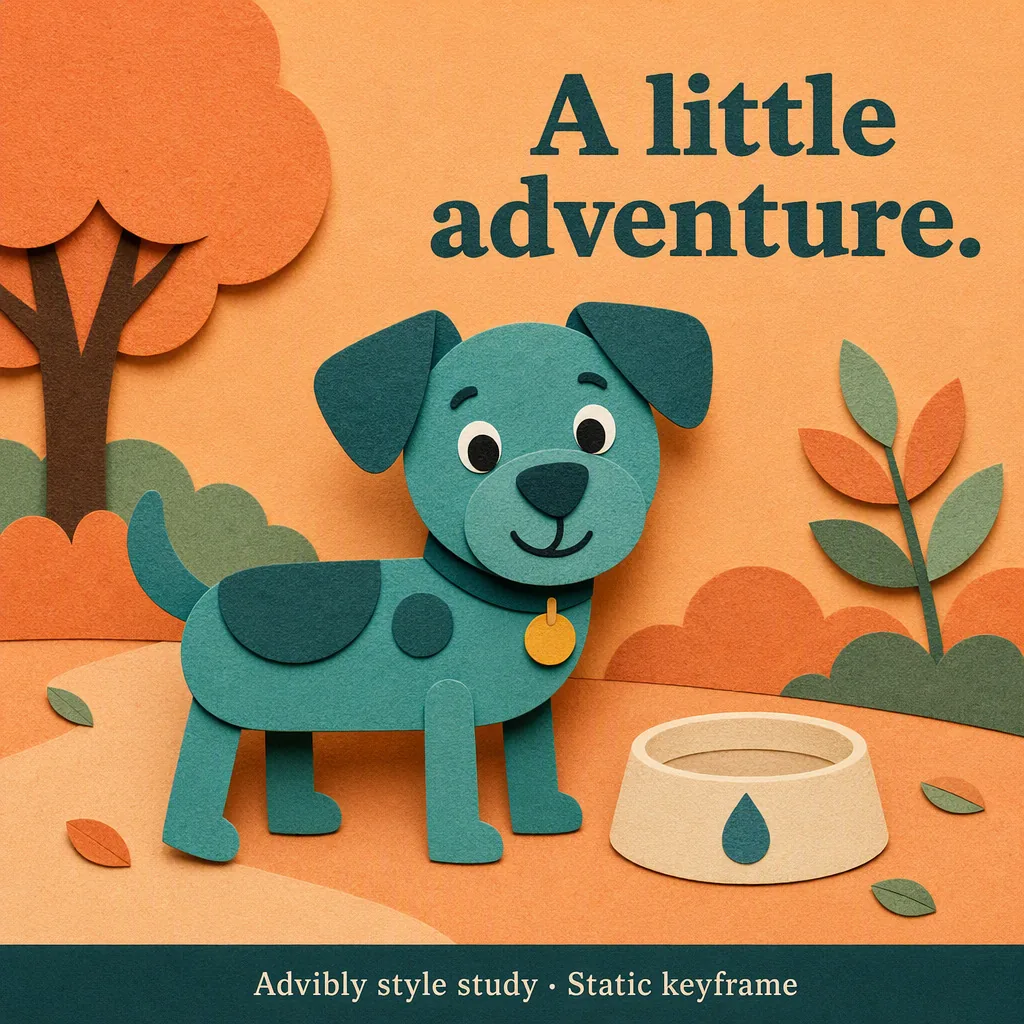
Simulated construction-paper shapes and shadows make the character readable. The texture is generated; no photographed stop-motion or moving character is claimed.
Give your characters their own proportions, palette and movement rules. A familiar paper texture is a material cue; recognizable franchise characters are a different creative choice. Start with a specific action, such as a character struggling to carry an oversized box, rather than a request to copy a famous show.
3. Photographic and archival collage
Cut photographs, printed labels and scanned objects into separate elements. Contrast comes from their juxtaposition: a tiny person beside a large machine, or an old photograph interrupted by a new annotation.
This can serve an editorial explanation or a history-led story. The hard part is sourcing. Record where each piece came from before building around it; a compelling image that can't be used for the intended distribution can force a late redesign.
4. Flat graphic shapes
Circles, arrows, blocks and typography can explain a process without characters. Replacement is part of the visual language: one shape becomes another through a deliberate cut, rather than an elaborate transformation.

Flat paper-like graphic shapes can support a realistic product cutout. This generated collage shows the style; it is not evidence of an editable layered source.
For a three-step onboarding explanation, let one card occupy the same position while its content changes. The repeated location makes the sequence readable. Too many unrelated shapes moving at once make the viewer search for the subject.
5. Layered paper worlds
Foreground, middle ground and background move by different amounts to suggest depth. This is a staging approach you can combine with the other looks, not a requirement to construct a physical multiplane camera.
Use it when the setting contributes to the idea: a boat passing through waves, for example. Reserve a clear area for the subject. Extra layers aren't useful if every moving edge competes for attention.
6. Flat articulated characters
Visible piece boundaries and hinge-like motion distinguish this look from a continuously redrawn character. An arm can rotate as one piece while a hand changes to a separate pose.
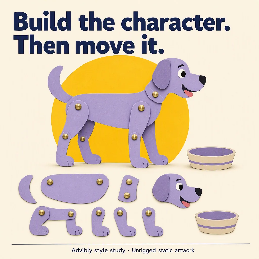
The visible segments and fastener circles illustrate articulation. This is unrigged static artwork, not an editable puppet, completed animation or software screenshot.
A digital rig is one way to produce it, but the visible style doesn't require a particular program. Plan the joints around the action. A shoulder built for a side-view wave might not work for a turn toward the camera.
Play an actual articulated digital puppet
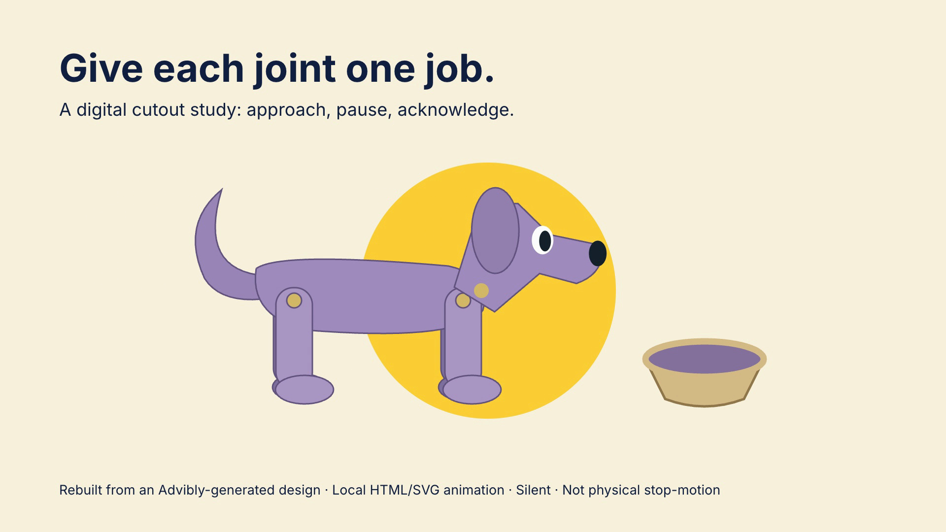
Open the exact articulated puppet poster image.
Watch the complete seven-second articulated-puppet study (silent MP4)
Download the reproducible HTML/SVG source and render instructions.
This original flat dog is constructed from separate SVG shapes. Limb groups pivot while the body travels; the head and tail have their own motion. It is a code-authored articulation study, not physical hinges, hand-shot stop-motion or proof of a named desktop animation app. The supplied source uses GSAP 3.14.2 and renders with HyperFrames 0.8.35; the archive explains the Node, FFmpeg and network prerequisites. Change a limb angle or timing, render again and inspect contact and continuity. The film is intentionally silent.
7. Product collage
Combine product photography or UI captures with paper shapes, labels and editorial annotations. This is an application of cutout styling, useful when the real object must remain recognizable while the surroundings become playful.
Keep an approved packshot separate from decorative pieces. If the brief requires the packaging to stay unchanged, animate its position as a whole rather than asking an effect to redraw the logo or bend the container.
A digital cutout-style example in motion
The short boat example below gives the layered-paper idea a moving reference. Look at the red subject against the blue waves and the restrained composition; it doesn't need a character performance or a complicated camera move to establish the treatment.
AI-generated digital cutout-style illustration made with OmniFlash through Advibly, not photographed paper stop-motion. The audio was removed; the picture is unchanged. This example demonstrates an appearance, not a completed Collage Motion workflow or an editable layered project.
Four ways to make cutout animation
Choose a method from the job's hardest constraint. The tradeoffs below are production recommendations, not a benchmark ranking of speed, cost or quality.
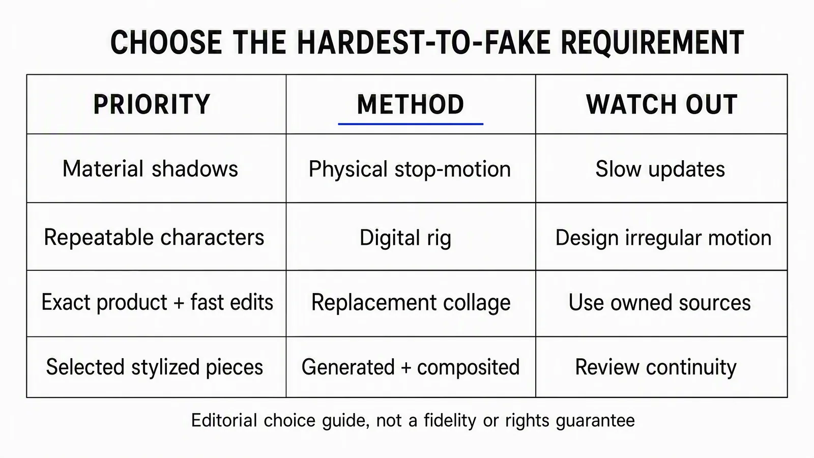
Use this as a starting decision guide, not a guarantee of fidelity, speed or rights clearance. The method still needs a representative test.
Method 1: Physical stop-motion
Cut the pieces, arrange them under a fixed camera, move them between exposures and assemble the frames. Start with a small setup: one background, one subject, stable lighting and a repeatable camera position. Check a short playback before shooting the full sequence.
Physical capture records the actual materials and their interaction with light. That's useful when the craft itself is part of the story. It also means a moved camera, changed light or damaged paper piece can interrupt continuity. Photograph the starting arrangement and keep spare parts for pieces you expect to handle repeatedly.
The BFI's archive account of Lotte Reiniger's Cinderella figures describes articulated card figures and layered transparent backgrounds. The practical lesson is to plan movement and visibility together: a beautiful static silhouette can still fail when its limbs overlap during an action.
Method 2: Digital rigging
Build the character from separate artwork pieces, assign pivots and connect related parts. Moving a parent piece then carries its children, while a joint can rotate independently.
For a waving figure, test the shoulder, elbow and hand before finishing every expression. If the forearm separates from the upper arm, check the pivot, overlap and parent relationship before adding more motion.
The Godot cutout tutorial illustrates this relationship between piece hierarchy, pivots and depth order. Its current page warns that it hasn't been fully updated for Godot 4.7, so use it for the construction principle, not as an assumed current menu-by-menu guide.
Rigging can support recurring characters, but only within the poses and views you've designed. A side-view rig doesn't automatically solve a front-facing turn. Plan a replacement drawing or a different shot where needed.
Method 3: Digital replacement and collage
Arrange separate photos, shapes, labels and poses in a compositor or animation editor. Animate position, scale and rotation where useful, and swap a piece when a new drawing communicates the next state more clearly.
This gives changing copy and product assets their own controls. Keep text editable and use the source packshot instead of baking both into a generated background. A later headline change can then be a text edit rather than a new scene.
Preserving a source image doesn't guarantee a perfect export: scaling, cropping, compression and effects can still damage small details. Compare the rendered label with the approved source at the intended viewing size.
Method 4: Generated pieces plus controlled assembly
Generate supporting textures, environments or selected stylized shots, then assemble them with the assets that must remain stable. Decide in advance which parts may change and which must not.
A prompt for blue paper waves can leave room for interpretation. A real medicine label, pricing screen or customer's face needs a different level of control. Don't treat a plausible generated object as a verified substitute for an exact source asset.
A finished video can look layered while being a single flattened file. If editable layers are a deliverable, specify them separately and inspect the actual project files. The appearance alone doesn't establish how the shot was built.
What existing films teach about the look and the method
Cutout isn't limited to dark silhouettes. The NFB's technique overview points to the shapes and color in Le Merle and identifies The Hungry Squid as digital cutout. Use these as references for the medium's range, not as evidence that one approach performs better in an ad.
South Park offers a clear historical distinction. Its June 2013 production FAQ says the pilot used real construction paper and subsequent production used computers with scanned paper textures. That's a dated account of its pipeline, not a claim about every tool it uses today.
The transferable point is simple: you can retain a material-looking design without physically photographing that material for every frame. Describe the resulting work accurately.
Build the scene as replaceable parts
Separate a layer because it needs its own movement, replacement or review, not merely to produce a complicated stack.
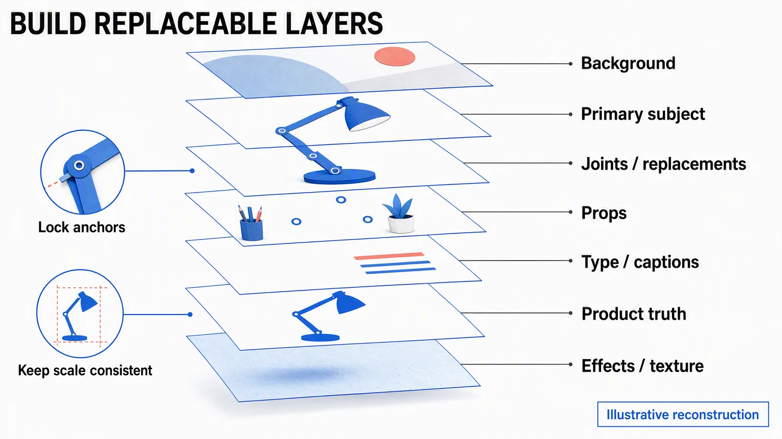
Conceptual reconstruction, not a screenshot of an editable rig. “Product truth” means the reference and review role; it need not be another visible plane in the final composite.
Keep the background independent of the subject. Place props on their own layers when they enter or leave the scene. Separate captions from textures so a shadow change doesn't make the words harder to read. For articulated pieces, mark the pivot and leave enough hidden overlap to avoid gaps during rotation.
The distinction saves unnecessary work. If a product only slides into view, you don't need to split its hinge, shade and base into a character rig. If the hinge must demonstrate a real range of movement, a generic paper puppet isn't enough evidence of the product's mechanics.
A worked five-second product-collage brief
Use this fictional desk-lamp scene as a planning example. It isn't a produced campaign or a claim that the diagram's lamp is a real product. Five seconds is the chosen test length, not a universal production standard.
Message: a compact lamp belongs in a small workspace. Look: product collage with flat blue paper shapes. Provisional method: digital replacement/compositing, because the packshot must remain recognizable and the headline may change.
Sources to supply: an approved lamp packshot with the needed usage rights, a brand color reference and approved copy. Keep a source ledger; “approved” here describes a required input, not a clearance already obtained for this example. Build the decorative paper pieces separately.
|
Time |
Planned action |
|---|---|
|
0–1 second |
Establish a plain desktop and one paper background shape. No competing props. |
|
1–3 seconds |
Slide the whole lamp packshot into position. Keep its proportions and label unchanged; don't articulate the hinge. |
|
3–4 seconds |
Reveal the headline “A place for brighter ideas.” Hold the product still. |
|
4–5 seconds |
Hold the composition with “Explore the lamp.” No new motion beneath the call to action. |
Layer plan: background, decorative shape, whole lamp image, shadow and two separate text elements. Anchor the lamp at its base; don't change scale halfway through the move. The shadow should follow the lamp's position without covering the text.
Sound and delivery: make the message work silently. For this proposed test, use a 16:9, 1280 × 720 export at 24 frames per second. That's 120 output frames across five seconds, not a requirement to create 120 different poses. The final channel version can need a different composition.
Review: compare the product at the beginning and end of the move, read the headline at small card size, and check that the final hold lasts long enough for the chosen copy. If the line is rushed, shorten it or extend the scene. Don't force the message into five seconds just to obey the example.
Diagnose the test before scaling it
|
What you see |
What to inspect next |
|---|---|
|
A joint slips apart |
Pivot location, piece overlap and parent relationship. Test the widest intended pose. |
|
Texture flickers between frames |
Whether the texture changes independently of the object. Try a consistent texture layer or a simpler shot. |
|
A product changes shape |
Whether generation or deformation is redrawing it. Return to the approved source and restrict its transformations. |
|
Type becomes unreadable |
Viewing size, contrast and motion beneath it. Simplify the background and separate the text. |
|
Motion feels stiff |
Pose clarity and timing. A deliberate hold is valid; add movement only when it clarifies the action. |
After the test, confirm the method or change it. Only then build the full character system, additional scenes or multiple aspect-ratio versions. This avoids both extremes: designing a complete rig before learning whether it works, or testing without having chosen any workable setup.
Keep source records and material claims accurate
Record each asset's source, owner, permission or other basis for use, allowed edits, required credit and review owner. Track recognizable people and product claims separately where they appear. Keep generated outputs connected to their prompts and reference inputs.
For a US example, the Copyright Office's guidance for photographers explains that original photographs are protected when fixed and that copyright includes adaptation rights. Exceptions can apply. Cutting up a downloaded photograph doesn't by itself establish permission; a ledger records the review, but isn't legal clearance.
Label physical, digital and AI-generated work honestly. A simulated paper shadow is a visual effect, not evidence that somebody built and photographed a handmade set.
Take a cutout direction through Advibly
Begin with the existing brand library and real product sources. A saved brand kit keeps the chosen identity separate from other connected brands. When the creative angle needs work, Brand Intelligence can provide sourced context for the brief before production begins.
For the lamp example, request a product-grounded collage direction, keep the approved packshot as the reference for product detail, and create supporting paper scenery only where the library lacks a suitable asset. Collage Motion or a paper-oriented explainer direction can suit this treatment. A three-dimensional papercraft look is a different visual decision from flat cutout; choose deliberately instead of combining every available style.
Continue with the approved scenes, assembly, captions and voiceover where the message needs them. Reuse the visual direction for a supporting still or carousel, adjusting the composition for each format rather than cropping the headline away.
Advibly's workflow also includes scheduling and publishing to supported connected platforms, followed by status checks and post-publishing analytics. Keep the approved asset, caption, destination and result together so a later variant can be compared with the version that actually went out. Publishing to a social account isn't the same operation as buying paid media.
For genuine handmade material capture, shoot the physical work and bring those approved assets into the wider campaign. For a digital cutout direction, start from your brand assets in Advibly and keep the first motion test simple enough to judge.